Q2 2021 Update
Olivier Tassinari
@oliviertassinari
Matt Brookes
@mbrookesThis update covers our progress over the last three months. It also covers what we aim to achieve in the months ahead.
Overview
Product
Here are the most significant improvements since March 2021.
Core components
🔥 We've made enough progress to ship v5.0.0-beta.0. Here are a few statistics to give an idea of the effort that went into it:
- 12 months of dedicated focus. We stopped work on v4 early on to fully dedicate to v5.
- 3,475 pull requests.
- 5,092 commits (the extra commits came from the merge of material-ui-pickers)
- 398 new contributors.
- The equivalent of four full-time developers working on it on average (core team + community).
- 38 alpha releases, we release once a week.
👩🎤 We have rolled out the new style engine to all the components. The community provided invaluable assistance in completing this effort. In v5, we have standardized on the
styled()API as the styling foundation we build on top of, and introduced the thesxprop for one-off customizations. Thestyled()API is loved by the community, and implemented by a number of styling libraries: styled-components, emotion, stitches, goober, etc. It allows us to support them all with adapters.⚒️ We added a codemod CLI and 17 transformations (so far) to automatically migrate codebases from v4 to v5. If you're not familiar with what a codemod is, check out Effective Refactoring with Codemods by Edd Yerburgh.
💄 We have updated the style of the Slider to better match the Material Design guidelines, and kept a similar style as before under
size="small":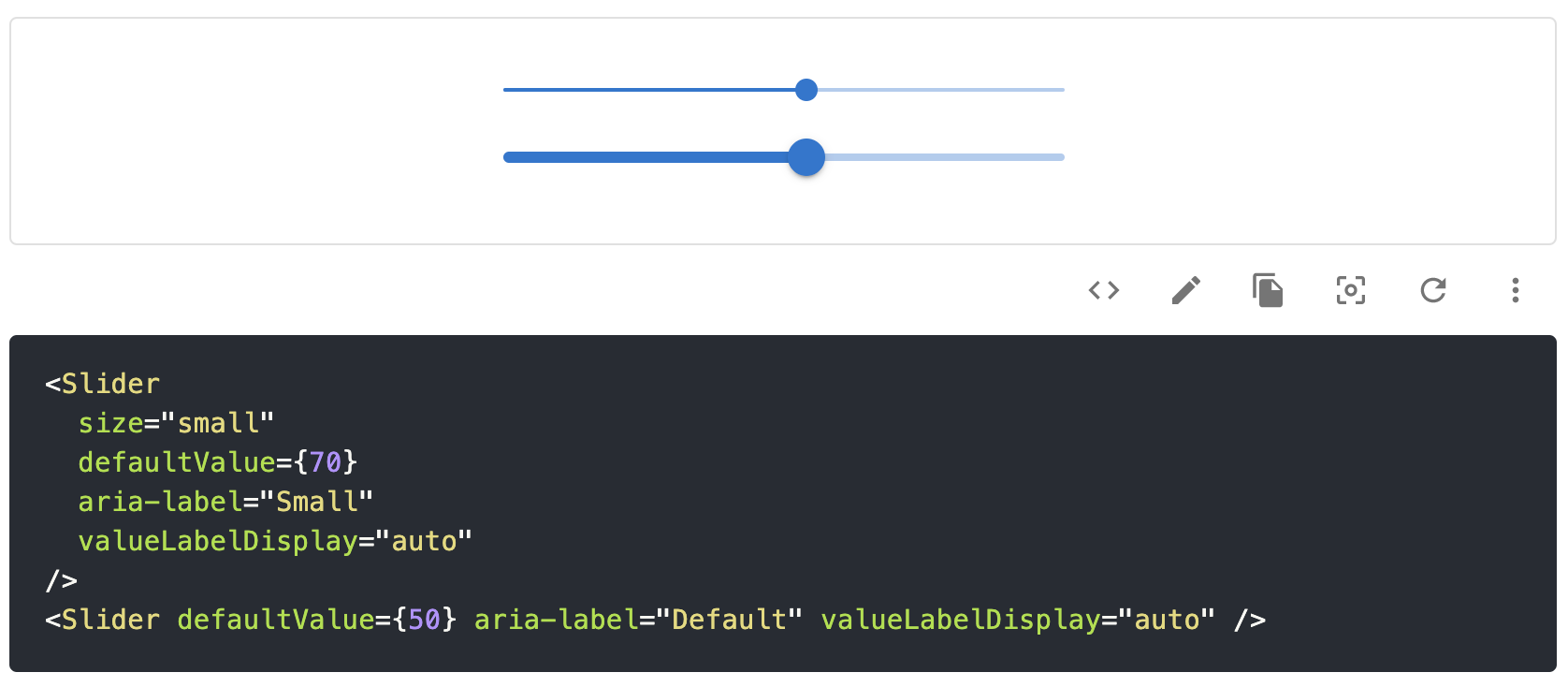
✨ The new style engine has unlocked problems on the
Gridcomponent that we couldn't solve before with JSS:We have added support for row & column spacing:
<Grid container rowSpacing={1} columnSpacing={2} />
We have added support for responsive values on all the props:
<Grid container spacing={{ xs: 2, md: 3 }} />
We have added support for a different number of columns than 12:
<Grid container columns={16}>
We have added an alternative implementation that uses CSS grid:
<Box display="grid" gridTemplateColumns="repeat(12, 1fr)" gap={2}>
  <Box gridColumn="span 8">
    <Item>xs=8</Item>
  </Box>
  <Box gridColumn="span 4">
    <Item>xs=4</Item>
  </Box>
  <Box gridColumn="span 4">
    <Item>xs=4</Item>
  </Box>
  <Box gridColumn="span 8">
    <Item>xs=8</Item>
  </Box>
</Box>
💄 We have improved the accessibility of the Link component:
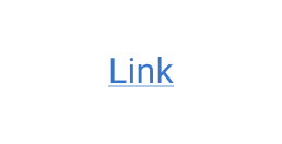
The underline helps to differentiate links in sentences.
Advanced components
We have primarily focused on the data grid components, fixing a lot of bugs.
Date Picker
The date picker is at the border between the core component and advanced components realms.
- 🐛 We have fixed a couple of straightforward problems: visual bugs, use of the
componentsprop for customizability, etc. - ⚙️ We have continued to focus on addressing technical debt present in the picker components.
Data Grid
🚨 We have continued to work on breaking changes to reach a stable version. We think that the component is good enough for use in production (and many developers already are using it), but we want to get the public API right before committing to a stable release.
✍️ We have added support for the cell edit mode.
🐛 We have focused on fixing bugs and regressions to ensure early users have a great experience with the component. This was done instead of taking on ambitious new features. We want our users to be able to adopt new features as fast as we build them.
🔘 We have added support for a built-in single select column type:
the CodeSandbox
and the boolean column type.
🚀 We have improved the performance. Client-side sorting and filtering are 2-3x faster on large data sets. We have improved the UX when scrolling. We have added memo logic on the render cell's parent, and worked on its effectiveness to reduce the re-rendering of custom cells. We have identified more opportunities to improve the performance that we will prioritize later.
📚 We have worked on providing more reference documentation. We are semi-automatically generating it from the TypeScript source definitions, with the descriptions. For instance, you can now find all the properties available of the
GridColDef.⚡️ We have fixed support for components that use portals, like Select and Autocomplete, in the cell editing mode.
🌏 We have accepted many new built-in locales (+15) from the community, after the introduction of the feature in Q1.
Design Kits
Figma
Designers have a great sense of detail. We have polished the kit, using all the feedback that we could get. We have also introduced support for a dark mode! We have worked on making the design kit close to the React components. This reduces miscommunications between designers and developers.
Adobe XD
We have fixed performance issues and polished the kit.
Sketch
We have added support of a dark mode and polished the kit.
Company
OKRs
In the first quarter, we focused on introducing a handbook to share our culture and to help solve the N(N-1)/2 communication channels problem that comes with a larger team.
This quarter, we took on a new initiative to help us solve three problems:
- create alignment on the goals
- improve how we measure success
- create space to take on larger initiatives, away from the day-to-day PR and issue management
After considering different alternatives, we are going with the OKR methodology.
Growth between Q1 2021 and Q2 2021
- 📦 From 8.6M to 9.1M downloads per month on npm. We have 21.03% of market share inside the React ecosystem, up from 6.68%, 5 years ago.
- ⭐️ From 67.2k to 69.1k stars. Leave us yours 🌟!
- 👨👩👧👦 From 2,141 to 2,223 contributors on GitHub. We add on average one new contributor every day.
New members
We have welcomed four new members to the company 🏢:
Jun, leads the implementation of a second design system.

Michał leads the initiative around the unstyled components.

Danilo, a Lead Designer to raise our design game.

Flavien, an engineer with previous experience building design systems and a complex 2D JavaScript rendering engine. He's helping us take on bolder problems on the advanced components (X team), starting with the data grid.

We are also hiring for various roles! If you're interested in joining us, check out our jobs page.
Our roadmap intent for Q3 2021
We'll do our best, no guarantee!
Company
We have the following objectives:
- Continue to refine our processes and responsibilities to make sure we function well with over ten people in the company.
- Rebrand. We started this effort one year ago but, failed to execute on it. With Danilo (design) and Jun (code) in the team to own the effort, we can finally make it happen. We will take a step to distinguish ourselves from a strong association with Material Design.
- Open and fill 4 roles. We need to strengthen the X team (advanced components) We also want to initiate the development of a bold new product vertical.
Core components
- 🚀 Get v5 stable out! At this point, v5-alpha has about 1% of the downloads of v4. It has a lot of accumulated value not being realized. We're aiming for 25% of the community to have migrated by the end of the quarter.
- ♨️ Fix the friction the community has during the upgrade to v5. We want to make the upgrade feel painless.
- ⚛️ Support React 18. Sebastian is part of the React Working Group, focusing on making us ready ahead of time. We want our most demanding users to feel empowered by Material UI, not slowed down by a third-party library.
- 🦴 Migrate more components to
@mui/base. Michał has recently added support for the Switch. You can follow our progress in the umbrella issue. - 🌈 Do a proof of concept on supporting a second design system. Some of our users (and potential users) dislike Material Design. We will try to make the second design system one that they love!
- 🗓 Execute on all of the items in the public roadmap.
- ❓ Please upvote GitHub issues if you want us to focus on a specific problem. The number of 👍 helps us to prioritize.
Advanced components
- 🚀 Release the first stable version of the Data Grid.
- ✨ Resume work on the key features, after a quarter focused on stability. It seems that the audience is adopting the data grid as fast as we can build it. For instance, we have one issue with over 1,000 upvotes 👍.
- 🗓 Execute on all of the items in the public roadmap.
- ❓ Please upvote GitHub issues if you want us to focus on a specific problem. The number of 👍 helps us to prioritize.
Design Kits
- Handle designers' pain and bug reports to polish the products.
- Run a survey on thousands of customers to identify important improvement opportunities. Should we build plugins to more easily switch the token variables between design and code? Should we add more in context examples? Should we focus on inconsistencies? etc.