Q1 2021 Update
Olivier Tassinari
@oliviertassinariThis update covers our progress over the last three months, and what we aim to achieve in the months ahead.
Product
Here are the most significant improvements since December 2020.
Core components
👩🎤 We have worked on rolling out and scaling the new styling engine to all the components. At this point, we have migrated 129 out of 167 components to emotion/styled-components. Most of the components left to be migrated are in the lab. We are almost done! You can subscribe to material-ui#24405 to be notified once finished. The community has provided invaluable assistance.
📚 To complement the migration of the components, we have worked on the migration of the code examples in the documentation, favoring the
sxprop where possible. When a component needs to render styles based on the provided props, we have used thestyledAPI. Effectively,makeStyleandwithStyleshave been removed from the demos (we will deprecate these modules later on). You can subscribe to material-ui#16947 to be notified once finished.📚 We have used the update of the documentation as an opportunity to break down the demos into smaller single-focus ones, with inline previews. For instance:
Before
was turned into multiple chunks, among them:
After
🥞 We have introduced a new
<Stack>component. It handles one-dimensional layouts. It allows working around the lack of browser support for the flexboxgapCSS property (no support in Safari).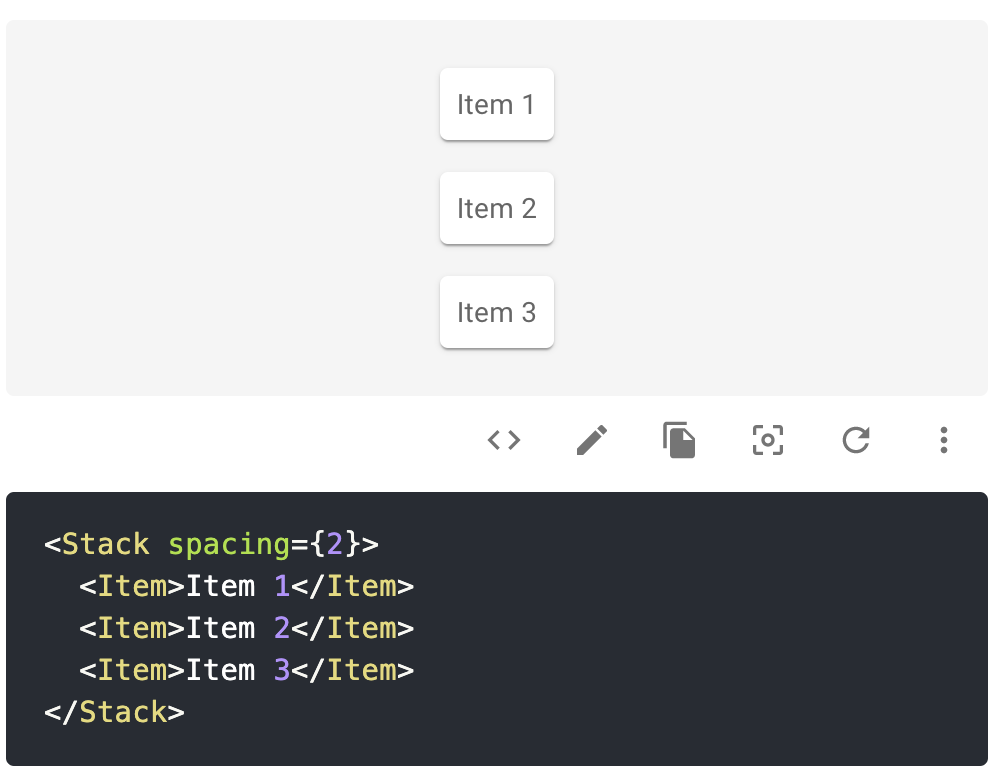
You can find more details in the documentation.
🎨 We have improved the support for custom colors and variants. This is one of the most upvoted issues in the GitHub issue tracker. The migration to the new style engine allows us to fully rely on dynamic styles. Developers can now do the following:
import { createMuiTheme, Button } from '@mui/material';

// 1. Extend the theme.
const theme = createMuiTheme({
  palette: {
    neutral: {
      main: '#5c6ac4',
    },
  },
});

// 2. Notify TypeScript about the new color in the palette
declare module '@mui/material/styles' {
  interface Palette {
    neutral: Palette['primary'];
  }
  interface PaletteOptions {
    neutral: PaletteOptions['primary'];
  }
}

// 3. Profit
<Button color="neutral"  />
This new feature removes the need to create a wrapper component.
📍 We have synchronized the icons with the latest update of the Material Design icons.
Google has moved its icons to a new location: https://fonts.google.com/icons. At the same time, they have increased the number of provided icons from 6,500 to 8,500. You can find all these icons under the@mui/icons-materialpackage.🦴 We have migrated a couple of components to the
@mui/basepackage. The aim of the package is to host the unstyled and headless (hooks) components. So far, you can only find:- Backdrop
- Badge
- Focus trap
- Modal
- Slider
We are synchronizing the development of the Base package with the creation of the second theme (and not v5).
🛠 We added a subset of MUI System as flattened props to the CSS utility components (Box, Typography, Stack, and Grid). We initially didn't plan to do so but reversed on hearing the feedback from the community. In addition to using the
sxprop, you can now do, for example:
<Box display="grid" />
<Typography p={2} color="text.secondary" />
<Stack mt={1} />
<Grid color="success.main" />
Note that with the other components, only the sx prop is available.
- ⚓️ We have introduced a new release line:
v4.x.x-deprecations.x. This release line is kept in sync with the latest version of v4 and includes actionable deprecations to ease the migration to v5.
Advanced components
We have primarily focused on the data grid components, fixing a lot of bugs, but also delivering new features.
Date Picker
The date picker is at the border between the advanced components and the design system realms.
- 📚 We have fixed the generation of the API pages. We now document all the props supported by the public pickers components, for example DatePicker.
- ⚙️ We have mostly focused on addressing the technical debt present in the picker components (ported from
@materal-ui/pickers).
Data Grid
🔄 We have started to bring support for lazy-loading.
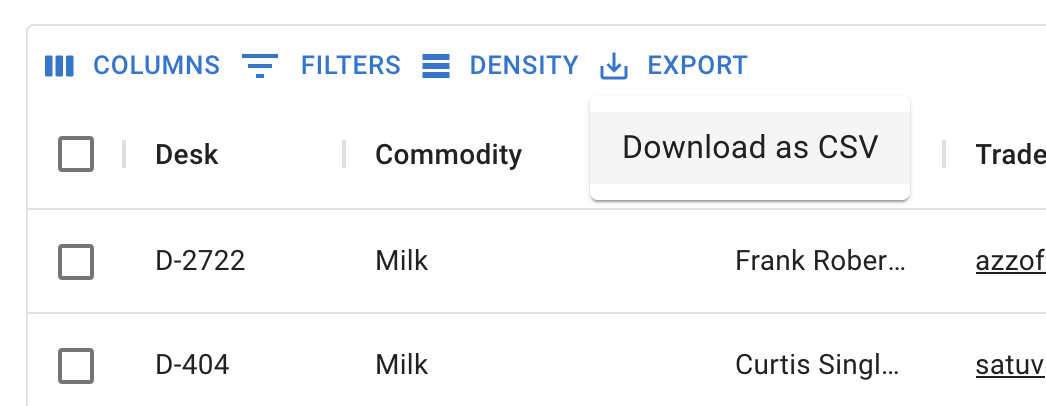
⬇️ We have introduced support for CSV export.
♿️ We have fixed a couple of accessibility issues (more in progress).
🌏 We have introduced support for custom locales.
🚨 We have started to work on breaking changes to reach a stable state.
💾 We have extended the support of @mui/material to handle v4 and v5 at the same time. In the future, we might desynchronize the release version of mui/material-ui and mui/mui-x. For MUI X, we will likely need to release breaking changes at a higher frequency: every six months.
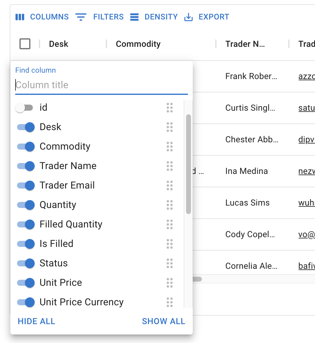
🎛 We have added a column selector.
Design Kits
Figma
We have migrated all the components to leverage the Figma variants feature. We have also taken this as an opportunity to polish the components:
- Improve the use of auto-layout
- Fix theme design token usage
- Add the Autocomplete component
Adobe XD
We have made Adobe XD available with a first release.
Sketch
We have redesigned most of the components from scratch to make sure all components show their CSS properties using inspection tools such as Sketch Cloud Inspect tool.
Company
Handbook
The most important change inside the organization is the introduction of a company Handbook. The company is distributed and operates across different time zones. Per the nature of our operation, and at the pace we are growing, we needed an effective and efficient way to share the organizational processes and culture. Per our transparency value, all the sections of the Handbook that don't contain sensitive information are publicly available.
This Handbook is the single source of truth. It's meant to be updated by any team member, to stay in sync with how we do things.
Growth between Q4 2020 and Q1 2021
📦 From 6.4M to 8.6M downloads per month on npm.
It seems that React keeps taking market share in the frontend ecosystem; it's growing faster than Vue or Angular. Most indicators point to it: Stack Overflow questions, stars, downloads, Traffic on the documentation. Our strategy to focus on React only seems to be paying off.⭐️ From 63.8k to 67.2k stars, leave us yours 🌟. We have seen a significant influx of stars this quarter.
👨👩👧👦 From 2,052 to 2,141 contributors on GitHub. We add on average one new contributor every day.
💰 Grew gross revenue at +4%/week on average during the period.
🏢 We have welcomed one new member to MUI: Matheus.
Our roadmap intent for Q2 2021
We'll do our best, no guarantee!
Company
We have almost signed with four new people to join the team this quarter (waiting for their notice period). We will welcome our first designer and a frontend developer to collaborate with him on a second theme. The two others will strengthen 1. the core components and 2. the advanced components teams. We will cross the ten-person milestone in the coming weeks (11).
We have the following objectives:
- Finish the implementation of the rebranding. A preview, the about and pricing pages.
- Onboard the new members and scale our processes as we double the size of the organization this quarter.
Core components
- 🚀 Get v5-beta (no more breaking changes) out! The development of this new version started almost a year ago. It's time to aim for the stable release.
- 📅 Start handling the issues with the date picker reported by developers.
- 🗓 Execute on all the items of the public roadmap.
- ❓ Please upvote GitHub issues if you want us to focus on a specific problem. The number of 👍 helps us to prioritize.
Advanced components
- ✍️ Release the Data Grid cell edit feature we have been working on for the last two months. A preview.
- 📅 Start dedicating time to the date range picker.
- 🗓 Execute on all the items in the public roadmap.
- ❓ Please upvote GitHub issues if you want us to focus on a specific problem. The number of 👍 helps us to prioritize.
Design Kits
- Release an update with the new Material Design icons on Figma, Adobe XD, Sketch.
- Figma, continue to polish the kit as our most important one.
- Adobe XD, improve the performance of the kit.
- Collect more users' feedback to identify the biggest improvement opportunities.