Introducing MUI Core v5
Olivier Tassinari
@oliviertassinari
Sebastian Silbermann
@eps1lon
Marija Najdova
@mnajdova
Michał Dudak
@michaldudak
Siriwat Kunaporn
@siriwatknp
Danilo Leal
@danilo-leal
Matt Brookes
@mbrookesAfter over 400 days of development and over 40 canary releases, we are excited to introduce MUI Core v5.0.0!

This release features some major highlights:
- High-level goals for v5
- A new brand
- Improved customizability
- Improved DX
- A new product line: X
- New components
- v4 migration
- Design Kits
- What's next?
- Thank you
High-level goals for v5
In our last survey, the number of developers that commented about improving the Material Design implementation was down by 60% compared to the year before. At the same time, 5X more developers were struggling to customize the components.
It is based on this context that we started to work on v5 in 2019. Our primary focus was to revamp the customization Developer Experience (DX). It had become clear that design (aesthetic, UX) and DX were key to unlocking the next stage of growth.
The last major iteration on the library was completed with v4, released two-and-a-half years ago, meaning over a year without innovation. So, we have approached v5 with a focus on delivering long-term value. For instance, we stopped all development on v4 as soon as we started to work on v5, and have taken the liberty of introducing breaking changes anytime we have identified a long-term upside.
You can find the initial RFC plan for v5 in issue #20012.
A new brand
Material-UI is now Material UI! We ditched the hyphen, head to the dedicated blog post to learn more.
We hope you are going to enjoy the DX improvement of only having to type 3 letters to type to find us on the internet: mui.com and to import us from npm @mui!
Improved customizability
Migration from JSS to emotion
The first step we took to improve the customization experience was to rethink the styling solution from a blank page.
If you have been following Material UI for a long time, you have probably noticed that we have iterated (a lot!) on the styling solution over the last seven years. We started with Less, then inline-styles, then JSS, and now emotion. Why change it again? We wanted to solve the following problems:
- The React community is settling on
styled()as the most popular CSS-in-JS API. We have used popularity as a proxy for "best".
const StyledDiv = styled('div')({
  color: 'red',
});

// or
const StyledDiv = styled.div`
  color: red;
`;
You can find it in styled-components, emotion, goober, stitches, or linaria.
While Material UI is compatible with any styling solution (as long as the styles have more specificity, for example, Tailwind CSS), many developers still felt the need to learn something new: the makeStyles API.
- Our React integration with JSS (
@mui/styles) is too slow to unlock the next layer of customization DX we aim for. The static CSS generation using v4 was fast enough, even faster than emotion, however, the dynamic style generation was too slow to be used in production. We would have needed to reimplement it. - Many developers were advocating for Material UI to migrate to styled-components, which would allow us to drop the custom React JSS wrapper we maintain. From our experience, maintaining a custom styling solution takes a considerable amount of time.
After exploring many different options, we settled on what we believe is a great tradeoff to solve the above issues:
We have made
styled()the lowest level primitive to add styles. This API is already known by many.We have defined a common interface with concrete implementations:
@mui/styled-engine: implemented with Emotion (default).@mui/styled-engine-sc: implemented with styled-components- If you are using a different styling library, feel free to contribute a wrapper. For instance, there is one attempt with goober, a library obsessing on bundle size (3kB gzipped).
This allows developers to swap between different style engines. For example, styled-components users no longer need to bundle Emotion and styled-component, nor do they need to configure the server-side rendering for each. How does the swap work? The same way it does from React to Preact.
For the last couple of months, we have been sponsoring Emotion with a $100/month grant. We are now increasing this amount to $1,000/month. It's in our best interest to help ensure the library keeps pushing the envelope, leading the state of the art in a competitive space.
The first immediate benefit of the move to Emotion was performance. The <Box> component is x5-x10 more performant in v5, compared to v4.
We would like to thank all the community contributors that made the migration of the components and documentation possible in #24405 and #16947: @natac13, @vicasas, @mngu, @kodai3, @xs9627, @povilass, @duganbrett, @queengooborg, and more. It was a major undertaking!
Going forward, developers can either keep using JSS with the legacy @mui/styles package or migrate from JSS.
We recommend the latter to match the core components.
The sx prop
While the styled() API is great to style complex components or to create highly reused components, there are cases where it's overkill.
We started to explore this problem three years ago with the introduction of the <Box> component to solve the following concerns:
- Switching context wastes time. The styled API forces you to constantly jump between the use of the styled components and where they are defined. Could we move the style descriptions right where we need them?
- Naming things is hard. Have you ever found yourself struggling to find a good name for a styled component? Could we remove the need to create and name yet another component?
- Enforcing consistency in UIs is hard. This is especially true when more than one person is building the application, as there has to be some coordination amongst members of the team regarding the choice of design tokens and how they are used, what parts of the theme structure should be used with what CSS properties, and so on.
In v5, we have pushed the solution one step further with the sx prop.
The prop is now available on all the components (made possible by emotion).
It exposes a superset of the CSS API: the normal CSS properties, shorthands, and media query helpers.
For instance, you can add one unit of vertical margin with:
// add margin: 8px 0px;
<Slider sx={{ my: 1 }} />
Developers already seem to love it.
You can find a side-by-side comparison of styled() vs. sx in the documentation to determine when you should use the prop.
Some developers use sx for everything, others only in simple cases.
The four components categorized as CSS utilities: Box, Grid, Typography, and Stack pushes the approach one step further.
They expose a subset of the sx prop as flat props, for instance:
<Typography color="grey.600">

// is equivalent to
<Typography sx={{ color: 'grey.600' }}>
See the API tradeoff section of the documentation for why not all the components accept these flat props.
Dynamic props
React is about composition. Developers can import one component, extend it, and re-export the wrapper. It's how developers have extended the core components up until v4. However:
- Each time you create a new component, it's another import option for your team. Now, you have to ensure that the right component is imported.
- Adding a new
color="success"prop to a Button component requires non-trivial CSS customizations. How do you ensure that all the styles (hover, focus, focus-visible) are consistent with the other built-in colors? - It adds a boilerplate.
For this reason, v5 comes with the capability to extend the built-in behavior of the components, right from the theme. This was one of the most upvoted GitHub issues: #13875. In practice, this change makes the MUI Core components extendable placeholders.
First, you can use the existing style mapping of the components.
For example, you can add a new neutral color to the palette, and the Button computes the right derivative colors.
import { createTheme, Button } from '@mui/material';

// 1. Extend the theme.
const theme = createTheme({
  palette: {
    neutral: {
      main: '#d79b4a',
    },
  },
});

// 2. Notify TypeScript about the new color in the palette
declare module '@mui/material/styles' {
  interface Palette {
    neutral: Palette['primary'];
  }
  interface PaletteOptions {
    neutral: PaletteOptions['primary'];
  }
}

// 3. Update the Button's color prop options
declare module '@mui/material/Button' {
  interface ButtonPropsColorOverrides {
    neutral: true;
  }
}

// 4. Profit
<Button color="neutral"  />
Second, you can add custom variants to the theme, overriding the CSS for specific component prop combinations.
import { createTheme, Button } from '@mui/material';

// 1. Extend the theme.
const theme = createTheme({
  components: {
    MuiButton: {
      variants: [
        {
          props: { variant: 'dashed', color: 'error' },
          style: {
            border: '1px dashed red',
            color: 'red',
          }
        }
      ]
    }
  }
});

// 2. Update the Button's color prop options
declare module '@mui/material/Button' {
  interface ButtonPropsVariantOverrides {
    dashed: true;
  }
}

// 3. Profit
<Button variant="dashed" color="error">
  dashed
</Button>
Global class names
In v3, we heard how frustrating using the classes prop API correctly can sometimes be.
In v4, we made a step towards adding global class names.
They are present, as long as no more than one ThemeProvider is used.
v5 doubles down on this direction by always adding global class names on the host DOM nodes. These class names are available for customizing the child elements, which can simplify the customization of complex components.
For example, compare these three options to turn the outlined input's border color red:
import TextField from '@mui/material/TextField';
import { outlinedInputClasses } from '@mui/material/OutlinedInput';
import { styled } from '@mui/material/styles';

// Option 1: global class
const CustomizedTextField1 = styled(TextField)({
  '& .MuiOutlinedInput-notchedOutline': {
    borderColor: 'red',
  },
});

// Option 2: global class + const
const CustomizedTextField2 = styled(TextField)({
  [`& .${outlinedInputClasses.notchedOutline}`]: {
    borderColor: 'red',
  },
});

// Option 3: classes prop (before)
const CustomizedTextField3 = styled((props) => (
  <TextField
    {...props}
    variant="outlined"
    InputProps={{ classes: { notchedOutline: 'foo' } }}
  />
))({
  '& .foo': {
    borderColor: 'red',
  },
}) as typeof TextField;
Option 1 is the simplest but if you want more type safety and do not use a magic string (MuiOutlinedInput-notchedOutline), you can use Option 2.
Unstyled components (alpha)
While hooks were high-risk experimentation when React released them in 2018, they are now ubiquitous. This is a great opportunity for MUI to expose more flexibility: headless components.
A key reason why developers pick MUI is to be able to build UIs faster. When they depend on us, they make a tradeoff. They estimate that applying new styles on top of the Material Design components will be faster than creating components from scratch or picking another library. They estimate that it will be performant enough, and they won't miss too much freedom.
This tradeoff works really well when having a small, constrained engineering team or a large team building internal (/secondary) tools. But what about the medium/large size engineering team that works on ambitious projects? Shouldn't they have a better option for not including Material Design and maximizing freedom than building the components from scratch?
We have started working on this exact problem, isolating the logic of the Material Design components into hooks and unstyled components. While the effort is still in alpha, you can already find the first building blocks in a new Base package.
So far it features:
const CustomButton = React.forwardRef(function CustomButton(
  props: ButtonUnstyledProps,
  ref: React.ForwardedRef<any>,
) {
  const { children } = props;
  const { active, disabled, focusVisible, getRootProps } = useButton({
    ...props,
    ref,
    component: CustomButtonRoot,
  });

  const classes = {
    active,
    disabled,
    focusVisible,
  };

  return (
    <CustomButtonRoot {...getRootProps()} className={clsx(classes)}>
      {children}
    </CustomButtonRoot>
  );
});
We discuss the effort in #6218. You can use #27170 to follow our progress.
Improved DX
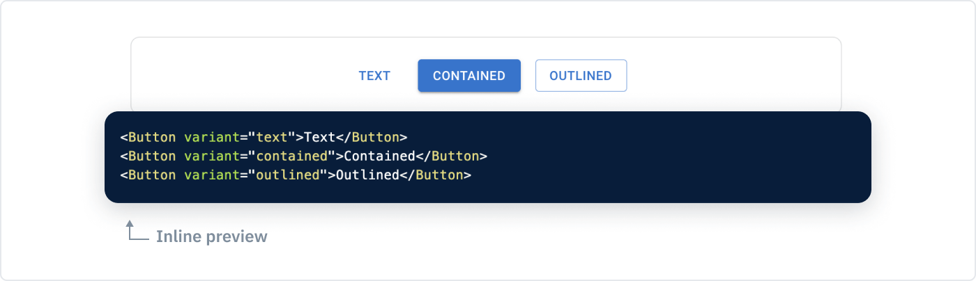
Smaller demos in the docs
We have used the migration of the demos from JSS to Emotion as an opportunity to rework them. Many of the demos were originally added taking into account how they would help maintainers work on the components. Instead, we have reversed the priority, putting the developers using them first.
In practice, this means breaking down complex demos into smaller ones. We aim to have as many "inline previews" as possible. It saves one click to expand the demo, and the mental overhead of figuring out what part of the code maps with what of interest you saw on the screen.
Props descriptions in IntelliSense
The best documentation is the one you don't need to open. We have moved all the prop descriptions to TypeScript, so IntelliSense in your editor can show you more context.
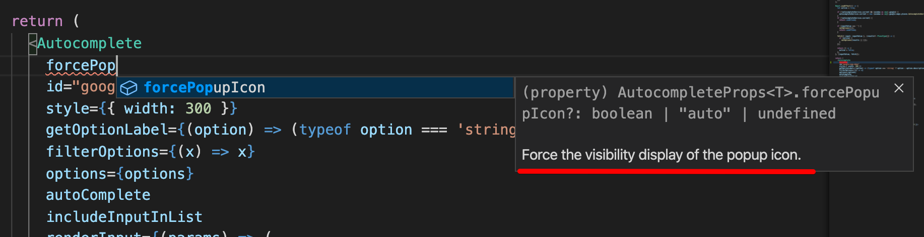
The popup explains what the `forcePopupIcon` prop is for.
These TypeScript prop descriptions are also used to generate the API pages of the documentation, so there is a single source of truth.
Migration from Enzyme to Testing Library
The migration of MUI from class components to hooks in v4 broke many of the tests we had written with Enzyme. Our tests were too coupled with the internals of React. We decided to transition our tests suite to Testing Library.
Fast forward a couple of years, Testing Library is now the most popular option to test React components in the community.
We are happy to report that we have migrated all our test codebase to Testing Library. You can use our tests as inspiration when you need to write new ones. The migration has even allowed us to rethink some of the implementations, making the components easier to test with the library.
TypeScript migration
The MUI Core codebase is not completely written in TypeScript yet but we have been coming a long way (MUI X is). In v4, we have written all the demos TypeScript first.
With v5, we have made new steps toward the adoption of TypeScript:
- We have made the TypeScript definitions the source of the API pages. This reduces the likeliness for a new release to include out-of-date definitions.
- We have migrated our first component to be written in TypeScript.
- We are writing most of the new code in TypeScript.
Overall, the language stats of GitHub give some qualitative measure of the progress:
- 02/2019: 1.6%
- 03/2020: 3.2%
- 07/2020: 5.3%
- 10/2020: 25.4%
- 07/2021: 35.4%
- Today: 36.1%

We expect the adoption of TypeScript to increase during the lifecycle of v5. With this organic adoption strategy, it might take us two years to close #15984.
Strict Mode support
This release is compatible with React.StrictMode.
This is the result of two years of work on the infrastructure.
We now run the tests and the documentation in strict mode.
Thanks for the patience, this has been an old and frequently requested improvement.
Bonus point, we run React v18 (unreleased) in a nightly build, in strict mode, without any test failures.
⚠️
@mui/stylesis not compatible with strict mode nor concurrent features.
A new product line: X
We are very excited to introduce a new product line to the MUI family: MUI X! We have recently released our first stable version.
MUI X embodies our initiative to solve the main pain point developers have reported two years in a row during our developer's survey: 2020, 2019. We have heard you, you want more components.
But, in practice, we wouldn't probably cover all the possible components you might need. It would be a titanic task. Instead, we are focusing on the hardest and most requested components, leaving the long tail to our community of contributors.
We started working on this effort over a year ago, in a new GitHub repository: mui/mui-x. You might wonder, why work on it as a different product? Building a great data grid or charting solution takes a considerable amount of time. Taking on the challenge of developing them required us to think about a different monetization strategy and we quickly realized that the team working on MUI X would need to become, at least, two times larger than the one working on MUI Core, which already has the community contribution.
Although each product has its unique vision and mission statements, they complement each other. A solid MUI Core foundation is essential for the MUI X adoption.
- MUI Core:
- Vision: Create robust foundations to build UI components. "Robust" is measured by how many developers decide to depend on it.
- Mission: Unlock design skills to developers while allowing them to build UIs fast.
- MUI X:
- Vision: Create the last UI component library developers will ever need. High quality, consistent, feature-rich, and covering the most frequent/challenging use-cases.
- Mission: Make building rich, data-intensive, dynamic apps a breeze.
MUI Core has a positive cash flow thanks to its paid templates, design assets, ads on the documentation, and backers/sponsors (❤️). The MIT license model works great for it.
However, none of these revenue sources would scale with the outcome and amount of work required for MUI X. It's why we are using an open core license model for this new product. The X components come in three different plans:
- Community. This plan contains the MIT components that are sustainable by the contributions of the open-source community. Free forever.
- Pro. This plan contains the features that are at the limit of what the open-source model can sustain. For instance, providing a very comprehensive set of components. From a price perspective, the plan is designed to be accessible to most professionals.
- Premium. This plan contains the most advanced features.
Let's have a look at our first component:
Data Grid
We have started the DataGrid and DataGridPro components more than a year ago with the ambition to deliver the best-in-class React data grid.
To achieve this we have a twin licensing model.
The DataGrid component is available under an MIT license for the features that can be relatively easily implemented, and that can be sustained with an open-source model.
The DataGridPro on the other hand is available under a paid commercial license for the more advanced features.
Check the Data Grid demo here.
Date Picker
We have transferred the ownership of the @material-ui/pickers from Dmitriy Kovalenko to the main organization.
The date picker components are now part of the @mui/lab package.
We spent a lot of time making sure they are consistent. We are now working toward reaching the same level of excellence as the other core components. These were our first TypeScript components in the codebase.
The date range picker will be part of the Pro plan, while the other date picker components are MIT licensed.
New components
This release comes with eight new components!
Improved Grid
The development of the Grid was mostly put on hold for the last three years, blocked by the size of the statically generated CSS with JSS. The migration to emotion has unlocked the following frequently requested changes:
Support for row & column spacing:
<Grid container rowSpacing={1} columnSpacing={2} />
Support for responsive values on all the props:
<Grid container spacing={{ xs: 2, md: 3 }} />
Support for a different number of columns than 12:
<Grid container columns={16}>
An alternative implementation that uses CSS grid:
<Box display="grid" gridTemplateColumns="repeat(12, 1fr)" gap={2}>
  <Box gridColumn="span 8">
    <Item>xs=8</Item>
  </Box>
  <Box gridColumn="span 4">
    <Item>xs=4</Item>
  </Box>
  <Box gridColumn="span 4">
    <Item>xs=4</Item>
  </Box>
  <Box gridColumn="span 8">
    <Item>xs=8</Item>
  </Box>
</Box>
More Material Design icons
The Material Design team at Google has released 600 new icons in five different themes since we released v4.
We have made them available in the @mui/icons-material package.
Stack
We have introduced a new <Stack> component
to handle one-dimensional layouts. It's's similar to how Figma handles auto-layout.
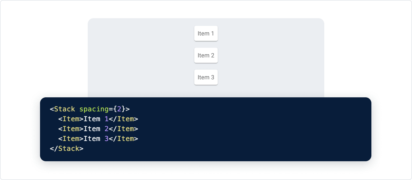
Note that you might already be using
<Box display="flex" gap={1}>to solve the same problem, however, browser support for the flexboxgapCSS property is lacking in Safari.
You can find more details in the documentation.
Promotion from the lab
We have moved six components from the lab to the main component package, after over two years iterating on feedback:
New in the lab
The lab hosts the incubator components that are not yet ready to move to the core. The main difference between the lab and the core is how the components are versioned. Having a separate lab package allows us to release breaking changes when necessary while the core package follows a slower cadence.
The following components are now available in the lab:
LoadingButton. It does what you would expect. It renders the
Buttonwith a configurable loading/pending state.FocusTrap. This component traps the keyboard focus within a DOM node. For example, it's used by the Modal to prevent tabbing out of the component for accessibility reasons.
Masonry. One great use case for this component is when using the
Gridcomponent leads to wasted space. It's frequently used in dashboards.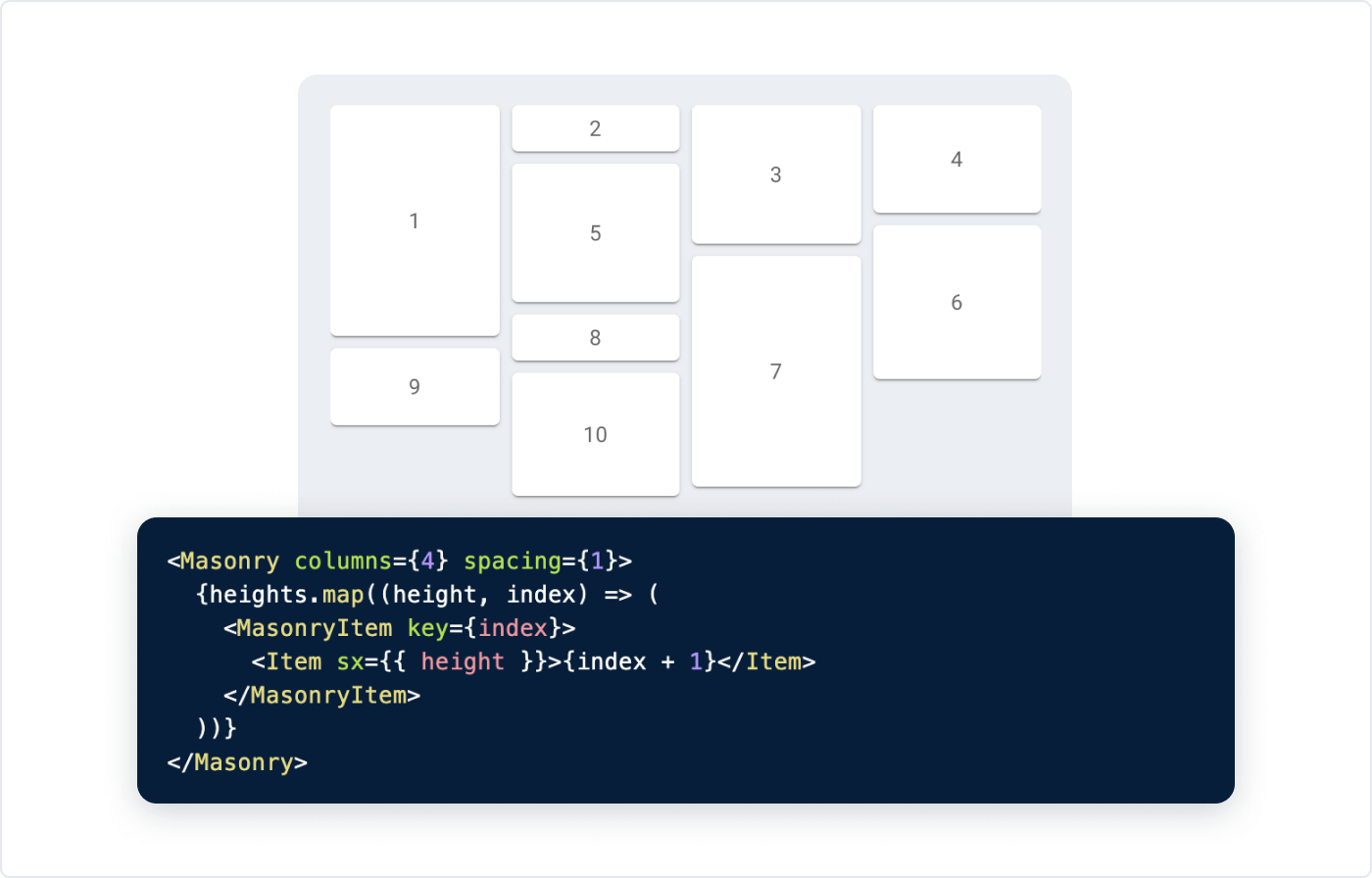
v4 migration
We have been meticulous to minimize the pain on the migration from v4 to v5. We know how daunting an upgrade can be.
We have used all the tools at our disposal. We have worked with the React core team to make React DevTools display warnings directly in the components panel. This should make it easier to find where components need to be updated for v5. See this CHANGELOG section for more details on it.
In the following sections, we will cover some high-level changes required for a successful upgrade. We have documented all the breaking changes, we have added as many deprecations as we could, we wrote codemods to automate the laborious tasks, and more!
If you are starting your upgrade, these are the three things you should look into:
- ⚓ We have introduced actionable deprecations in v4. You can upgrade to v4.12.0 and start preparing your codebase to be compatible with v5.
- ⚒️ We have prepared a codemod that does most of the transformations you will need for the migration. If you are not familiar with what a codemod is, check out Effective Refactoring with Codemods by Edd Yerburgh.
- 📄 Lastly, we have prepared a step-by-step migration guide. This guide is the one place where you can find all information required for upgrading to v5.
Change of the package names
To support our new brand, we changed some of the terminology used in the project. The npm packages have been renamed. For more details on this, check the migration guide.
Change of the styling solution
We have replaced JSS with emotion as a default styling solution while adding support for styled-components at the same time.
We recommend migration your customization from JSS/makeStyles/withStyles to the new APIs: styled and the sx prop.
If you are not ready to migrate away from the makeStyles API now, you can:
- add
@mui/stylesas a dependency and change the imports of themakeStyles/withStylesutilities - use
tss-react- its API is similar to JSSmakeStylesbut is powered by emotion, which minimizes the bundle duplication with the core components.
You can find more information for this on the Migrate from JSS section of the migration guide.
Changes to the supported platforms
This breaking change is an opportunity to drop the support of legacy upstream dependencies.
- We have updated the minimum supported TypeScript version from 3.2 to 3.5. This aims to match the policy of DefinitelyTyped, with versions of TypeScript that are less than two years old.
- We have updated the minimum supported node.js version from 8.0 to 12.17. This aims to match the LTS versions that are in maintenance mode.
- We have updated the minimum supported React version from 16.8 to 17.0. The breaking changes released between the two versions are very limited.
- We have updated the supported browsers.
- Internet Explorer: partial. We have kept the logic added in the past to support IE 11, however, we have stopped actively working on it. We can't guarantee that it works correctly. It's discontinued.
- Edge: from 14 to 91. The minimum version based on Chromium.
- Firefox: from 52 to 78.
- Chrome: from 49 to 90. We have assumed that Googlebot is always using the latest version of Chrome.
- Safari: from 10 to 12.5
These changes have allowed us to save 6 kB gzipped on the @mui/material package.
Design Kits
We now have design kits for the MUI components available in the three main design tools out there: Figma, Sketch, and Adobe XD. If you work together with a designer or team of designers, having them use the design kits makes for easier communication, as you'll be speaking the same language around the components. It'll also help designers to understand how the library is structured, especially theming features and each component prop, enabling much faster development.
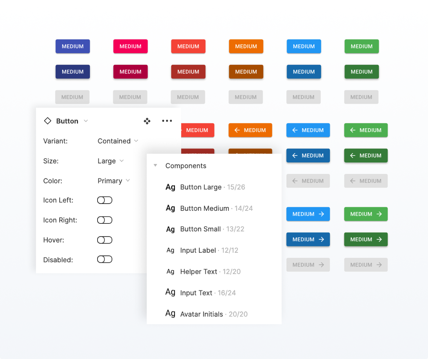
The design kits
Figma is the first design kit that benefits from the v5 update, and we're more excited than ever to get the kits into designers' hands! We understand that designers are generally more creative and productive when their physical and digital work environment is looking fresh — that is why our kits are now cleaner in every aspect, leveraging naming, easy component-showcasing, and consistency.
Some major changes to the components:
- We've added the new colors that v5 introduces (error, warning, info & success)
- All new components are covered
- States such as hover have been added for all relevant components
What's next?
Looking back, we are glad to say that, together, we have accomplished most of the objectives we defined in the v4 release blog post.
Some statistics with the released of v5.0.0 compared to the one of v4.0.0:
- 5,832 new commits
- 657 new contributors
- From 2M downloads/month to 9.5M downloads/month on npm
- From 350k users/month to 700k users/month on the documentation
We're also proud to share that the monetization initiatives we started right after the release of v4, such as the store, are working. We incorporated the company two years ago, have grown 2-3X per year since, and we're now over 10 people, with a positive cash flow 🚀. We are on track to reach 16 people by December 2021. We're hiring to grow our existing products, but also to explore a bold new product vertical, aligned with our mission.
We couldn't be more grateful for the trust that the React community puts in us. On average, we win 4% of market shares in the React community every year.
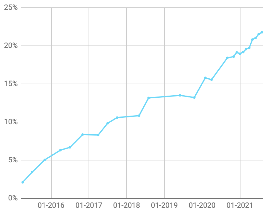
Material UI market shares in download relative to react-dom
We hope we can reach 50% of the React community by 2026. This is an ambitious goal, but not impossible.
A public roadmap
You can use the GitHub projects to learn about what features we're working on, what stage they're at, and when we expect to bring them to you:
We offer this transparency into what we plan to work on so that you can plan better and share feedback earlier to influence what we're building.
From a high-level perspective, we plan to focus in the upcoming period on the following topics:
- Core product:
- Unstyled components and hooks. We want to continue improving the customization experience.
- A second design system, that will help us grow MUI beyond Material Design.
- X product:
- Focus on the data grid component, by releasing the stable 5.0 version and developing the advanced features in our roadmap.
- Expand to a second component once the data grid is on the right path.
You can find more information about the new areas we are going to work on in the next sections.
Unstyled components and hooks
To continue improving the customization experience, we are doubling down on the version of the components without styles. These components and hooks contain the main functionalities and accessibility, without being opinionated about how styles are applied nor what styles. We still have work to do to have a full set of unstyled components.
You can read more about them in the docs and keep track of our progress in #27170.
Our high-level plan is to use the unstyled components and hooks as the basis of the Material components and second design system.
We are aiming to complete this work with the next major release (v6).
As of now, you can evaluate the unstyled primitives in a new Base package, or check out the next implementation of the Material Design components in the @mui/material-next package (targeted at v6).
Please note that both packages are in an alpha state so that we can release breaking changes –
we want to take the opportunity to create the best APIs we possibly can.
You can help us shape these new packages by taking part in discussions. There are RFCs waiting for your feedback. Don't hesitate to let us know what you think!
Second design system
Developing a new design system is one of the main initiatives, alongside this new brand and the unstyled components, to grow MUI beyond Material Design. Its codename is Joy and we have just started the high-level discussion around it.
It will be built on top of our foundation packages (the base/unstyled components and @mui/system) to provide the API shaped similarly to our Material Design components. We plan on having built-in CSS variables generated from the theme, a great dark mode API, a custom look and feel, and more.
We're aiming for developing the most frequently used components first, as we plan on releasing them continuously with each milestone. We intend to have Joy versions of all components already available on Material Design so that developers can then pick between them, choosing the design they like the most. The main difference will be the theme structure, where we want to achieve the right amount of flexibility while providing an amazing design by default.
We'll keep you updated about the progress. And as always, you're invited to contribute to it as well. Stay tuned!
MUI X
The data grid is the cornerstone of any application manipulating large amounts of data. We plan to focus on it as long as necessary to deliver most of the advanced features. We still have column pinning, tree data, grouping, pivoting, excel export, and more to build!
Once we would have grown the team and made enough progress, we will expand to a second component.
Design Kits
We plan to run extended research and surveys. We have already identified that accessibility is something leading companies care about. We are planning to cover more user interaction states for prototyping, for example focus-visible.
Thank you
Finally, one last thank you to everyone who's contributed to MUI Core v5. The whole team is very excited about this release! It's just the beginning. We will keep working hard to deliver the best possible React UI components while making it accessible to the many.