Strategies for building customizable components
Alexandre Fauquette
@alexfauquetteMaterial UI's components are used by hundreds of thousands of developers worldwide, encompassing the full range of implementation from minor side projects to massive company websites.
This variety of users presents a dilemma for us as maintainers: hobbyists working on side projects want fully built components that work right out of the box, so they can focus on the application logic; many larger companies, by contrast, want to be able to fully customize components to respect their brand design.
Managing these contradictory needs only becomes more difficult as component complexity increases.
This article reviews several different approaches that a developer might take to customize UI components, as well as the various tradeoffs associated with each method. Along the way, we'll explore how these tradeoffs ultimately led to the solution that we've settled on for customizing Material UI components: the slot strategy.
Style modification
(Don't need us to convince you to use a style library? Feel free to skip this section and move on to Logic modification.)
Good old CSS
Let's start with the easiest part: modifying the style. This will necessarily involve CSS—especially the notion of specificity, which says that if an element is targeted by two CSS selectors, the browser will apply the more specific one. Usually this means that the selector with more classes applied to it is more specific and therefore takes precedence.
For example, if we look at the Material UI Switch component, we have multiple subcomponents that we could expect to modify.
For each of them, we assign a specific CSS class:
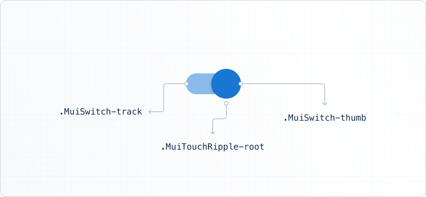
Notice that each element is styled using only one CSS class—the thumb style, for example, is applied with the css-jsexje-MuiSwitch-thumb class, so any CSS selector that includes more than one class will override its style.
I'm not a designer, so I made an ugly switch example using only CSS— you can play around with it in CodeSandbox:
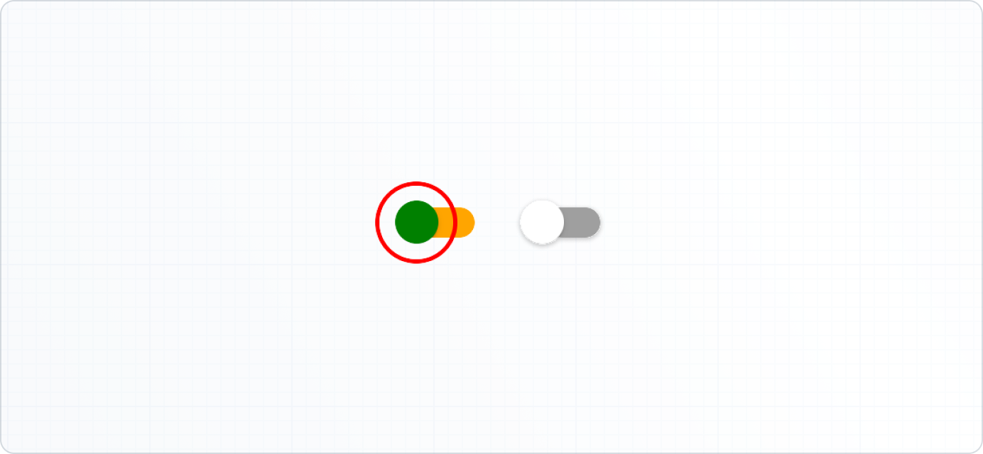
<Switch className="uglySwitch" />
/* two classes are more specific than the default single class selector */
.uglySwitch .MuiSwitch-thumb {
  background-color: green;
}

.uglySwitch .MuiTouchRipple-root {
  border: 2px solid red;
}

.uglySwitch .MuiSwitch-track {
  background-color: orange;
  opacity: 1;
}
Let JavaScript generate the CSS
Maybe you don't want to spend your time switching between CSS and JavaScript files, or writing long, cluttered stylesheets. To avoid these problems you can integrate styles directly into your JavaScript code. 🎉
Because the level of customization varies across projects, Material UI's components can be customized in several different ways. For more information on this topic, check out the Material UI customization documentation.
Logic modification
Styling is not the only thing you need to customize. You may have to modify the logic, which must be handled by the component itself.
Simply add a prop
Consider a React UI component that lets users rate a product.
The default setting ranges from a score of 1 to 5.
But what if you need to increase it to 10?
In this case, you could add a max prop that tells the UI what the highest possible rating should be, making it simpler to customize.
This works well enough for a simple UI element, but what happens when the component in question has many more moving parts?
It's never that simple
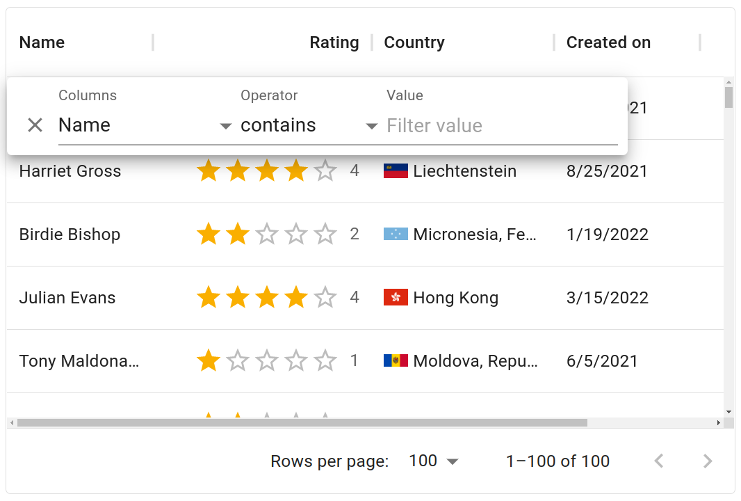
Let's play with a slightly more complex component: the DataGrid.
This component allows you to manage data by applying sorting, filtering, editing, exporting, and many other -ings.
To give you an idea of how complex this component can get, let's look at an example of a feature request for the DataGrid and think about how we could address it:
This request makes sense. When you have a lot of columns, sorting them can make it easier to browse the list. But how should we implement this kind of customization?
Adding a prop called filterPanelColumnInputSortingStrategy could work, but please, don't do that.
It just doesn't scale.
There are too many different props that developers might need to modify. You will end up with API documentation so long that it will take an eternity to scroll to the end—meaning nobody will read it.
Instead, consider these alternative solutions that can scale more efficiently with complex components:
Other solutions
Don't bother with components
Passing all the parameters as props of a single component doesn't work. So why not just create no components at all?
That's not a joke—that's the approach of headless libraries such as react-table. Instead of providing working components, they provide hooks for managing the features and let developers build their components on top of it.
If you're willing to start from scratch, it can be a nice approach. Use one hook to manage filtering, another one to manage sorting, and then build your UI using returned values.
This approach can scale because you can scope parameters to individual features. The filtering hooks will only take into account parameters impacting the filtering, and so on—so you can split your code feature by feature.
But because this is a fully custom approach, it will take the most amount of work relative to all other options to construct a functional UI. If your main priority is to get up and running quickly, then this may not be a viable solution.
Subdivide your components
Another approach I like is to provide subcomponents. This is what we do for Material UI components such as the Menu.
This is also the approach used by react-admin to provide a customizable administration interface. Here is their quick start example:
The idea is to put the Admin component at the root level of the app.
This component a provider that's responsible for managing all data fetching and passing that data back to components.
The second important component is ListGuesser which defines how the data should be displayed.
import * as React from 'react';
import { Admin, Resource, ListGuesser } from 'react-admin';
import simpleRestProvider from 'ra-data-simple-rest';

const dataProvider = simpleRestProvider('https://domain.tld/api');

export default function App() {
  return (
    <Admin dataProvider={dataProvider}>
      <Resource name="users" list={ListGuesser} />
    </Admin>
  );
}
If you're unhappy with the rendering of the ListGuesser, then you can define your own components by reusing smaller components.
If you're unhappy with the smaller components, in turn, you can replace those with custom ones as well, and so on.
So you start with a component that's fully functional right out of the box, and you can rewrite any of its constituent elements as needed.
This approach has one major advantage: it gives you a lot of flexibility. For example, you can easily modify the order of the components and their parent/children relationships.
This approach has also one major drawback: it gives you a lot of flexibility. For example, you can easily modify the order of components in a bad way. The more freedom, the more bugs.
Drawback example
To show you how easy it is to make a mistake using this technique, here is a personal example involving Material UI components.
I recently tried to wrap a TextField component in a FormControl, and was frustrated when it didn't work.
But the reason why is quite simple: the TextField component is itself composed of an input wrapped inside of a FormControl, and neither TypeScript nor console.error messages could warn me that my rendered markup was redundant and broken.
<FormControl>
  <TextField>
</FormControl>

// Equivalent to

<FormControl>
  <FormControl>
    <InputLabel />
    <Input />
    <FormHelperText />
  </FormControl>
</FormControl>
This trade-off makes sense for react-admin, which is used for building complete websites. Their users need complete freedom when it comes to rearranging components and introducing new components anywhere.
But MUI's products exist at a lower level.
We focus on the building blocks, not the entire website—though we do have templates for that. 😉
So that's not the approach we took for the DataGrid.
Keep a single component
For DataGrid, we wanted to make it as simple as possible to add the DataGrid to your application, so we stuck with the individual component structure, which is to say that to create a new data grid, all you need is <DataGrid rows={...} columns={...} />.
To customize this single component, we use what we call the slot strategy.
The slot solution
Now we are back to the original problem: how to provide deep customization options for a single component. Let's look at how we use slots to balance the freedom to customize with the need to avoid building from scratch.
Overriding default components
First let's modify the appearance of the grid. For color, spacing, and other basic properties you have CSS, but not everything is style related.
Here is a view of the grid with the filter panel open. There's an x icon on the left side of the panel for deleting the current filter.
Say you want to replace this x with a trash icon. You can't do it with CSS—you need DOM modification to replace the SVG icon.
To manage such a scenario, the DataGrid has a prop called components.
This prop lets you replace some internal grid components with your own custom ones.
In this case, the component to replace is the FilterPanelDeleteIcon, which becomes DeleteIcon:
<DataGrid {...data} components={{ FilterPanelDeleteIcon: DeleteIcon }} />
That's all it takes.
For every icon, there is a corresponding key in components that we call a slot.
If you provide a component to a slot, your component will be used instead of the default one.
Beyond swapping out icons, you can also plug native HTML elements into component slots, making it simple to customize the DOM structure of any component to suit your needs.
Passing props
Slots are great for customizing the style and structure of small components. But what about a situation like the aforementioned feature request, where we need to modify the logic of the Data Grid's column selector?
We can't provide a slot to override the selector alone, or else we would need to provide one for all of the inputs and buttons, which are too numerous to keep track of.
We could use a slot to override the filter panel. We provide this slot just in case you need a fully customized panel. But honestly, who wants to rewrite an entire component just for simple sorting options?
Instead, what would be nice is to have a prop called columnsSort that lets you sort the column selector in ascending and descending order.
By adding this prop to the default filter panel, we can derive a customized panel like this:
import { GridFilterPanel } from '@mui/x-data-grid';

function CustomFilterPanel(props) {
  return <GridFilterPanel {...props} columnsSort="asc" />;
}
But this strategy of adding props to customize components is a bit verbose.
So we added a way to pass props to an existing component using slotProps.
You can pass props to every slot on slots using slotProps.
Here's how to pass columnsSort='asc' to the filter panel slot:
<DataGrid
  componentsProps={{
    filterPanel: {
      columnsSort: 'asc',
    },
  }}
/>
This way of passing props is nice, because it scopes them.
Props for the filter panel live together in componentProps.filterPanel.
And the same goes for the toolbar, the column menu, and all other components.
It also works pretty well with TypeScript autocomplete, because none of the slots have very many props. So as soon as you've specified which slot you want to pass props to, your IDE will make good recommendations.
What should I use?
If your goal is to customize the style, please don't start from scratch—use libraries to manage your CSS. By adhering to solid class management standards, you should be able to provide styles that are easy to override.
You should add props to a component only if they impact the entire component—for example, disabling filtering impacts the whole grid, so a prop would be a viable solution here.
You should add slots to override icons, because it's common to need to replace them, so it should be easy to do.
Slots should also be added when your component is somewhat independent from the main one. For example, a grid can exist without its filter panel, or without its toolbar.
Customization is key
In our last two annual Developer Surveys, our users made it clear that customization is always a top priority when choosing a UI library.
Thanks to the slot strategy and the introduction of supplementary tools like MUI System's sx prop, it has never been easier to customize Material UI's components to suit your specific needs.
Material UI and Joy UI are designed to be both beautiful and flexible right out of the box, while Base UI gives you the most freedom to implement your own custom styling solution.
MUI X is comprised of fully featured complex components like the DataGrid which—as we've seen—can still be customized in many ways with minimal friction.
Get started building with the MUI X Data Grid by installing the MIT-licensed Community package today. And be sure to let us know what you think about the customization experience!