Introducing MUI X v6
José Freitas
@joserodolfofreitas
MUI X v6.0.0 is finally here with many improvements, new features, customization abilities, and a more robust foundation to accommodate the changes we want to deliver next.
Table of contents
- Data Grid - feature highlights ✨
- Date and Time Pickers - feature highlights ✨
- Installation and migration
- What's next
- Decoupling versions from MUI Core
- Feedback
Data Grid - features highlights ✨
ApiRef moved to the MIT (Community) version
Manage pagination, scrolling, state, and other attributes through the Data Grid's API object—previously only in commercial plans, now available to all users.
The apiRef enables developers to implement a whole new range of customizations that rely on programmatic control of the Grid's features.
function CustomDataGrid(props) {
  const apiRef = useGridApiRef();

  return (
    <div>
      <Button onClick={() => apiRef.current.setPage(0)}>
        Go to page first page
      </Button>
      <DataGrid apiRef={apiRef} {...other} />
    </div>
  );
}
See the apiRef reference documentation for more details.
This is the first feature we ever move from the Pro plan to be MIT licensed. We identified that this feature in the Pro plan was going against our objectives. Our goal is for MUI X data grid to become the best grid for React developers, when compared to other standalone open-source grid. To do such, developers need to have access to all the primitives required to customize it.
And if you want to understand more about our view of the open-source/commercial balance, check our Stewardship page.
Improved column menu
Another significant step in terms of customization but also usability; the v6 column menu now provides support for icons, menu groups, custom items and actions, and more. We've redesigned this subcomponent to make it as extensible as possible.
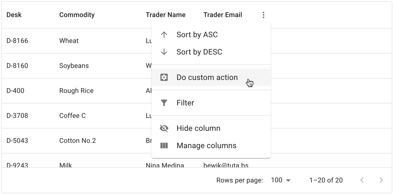
A demo of the column menu when open and with one item hovered.
This improvement is part of an overarching effort throughout the life cycle of v6 to refactor all Data Grid panels.
Row pinning is now stable
Row pinning was previously released in a minor v5 version under the experimentalFeatures={{ rowPinning: true }} flag.
The API is now stable, thanks to the community for trying it out and reporting bugs.
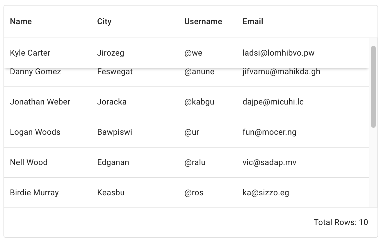
Aggregation is now stable
Aggregation was previously released in a minor v5 version under the experimentalFeatures={{ aggregation: true }} flag.
The API is now stable, thanks to the community for trying it out and reporting bugs.
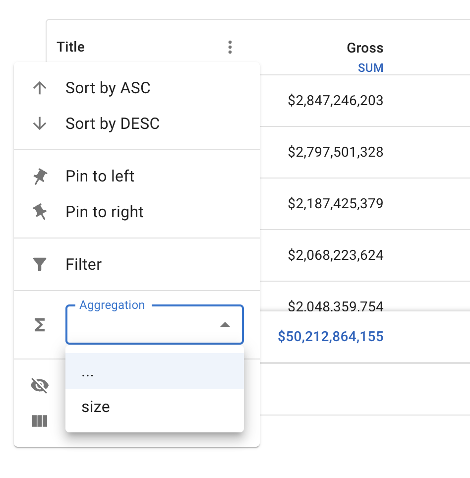
The footer of the second column is a sum all its cells.
Cell selection
Cell selection is a powerful and flexible way to select data in the Data Grid. It allows end-users to select a cell or group of cells like in an Excel sheet.
A demo of the cell selection.
This feature will serve as the base for clipboard importing / bulk editing (coming soon). The API is unstable in this first release but you can enable it with:
<DataGridPremium unstable_cellSelection />
Use web workers to export data to excel files
By default, the Excel file export is generated in the main thread. This can freeze the UI when exporting large datasets.
You can now use a web worker in the background to allow interactions with the grid while the data is exported.
Date and Time Pickers - features highlights ✨
Fields: the new default <input> for Pickers
Legacy mask input
In MUI X v5, the <input> behavior of the pickers components were implemented with a mask approach.
This had many UX downsides. for example, watch what happens when we edit the day on this masked input, you lose the year:
A demo of the date pickers on MUI X v5.
New "Fields"
This mask logic is now gone. "Fields" implement the new rich text fields that solve the mask input limitations. They are specialized for date and time logic and offer quick navigation and isolated interaction within each section of a date value. See it in action:
This design is heavily inspired by the native date picker UIs provided by platforms like macOS and Windows on the web.
Birthday picker
Up until MUI X v5, we were recommending the use of 3 separate inputs to implement a birthday picker, and especially not the use of a <DatePicker>; see this article for why Designing Birthday Picker UX: Simpler Is Better.
Birthday pickers can now have a great UX thanks to the Fields. They behave almost like 3 separate inputs and support full letter month which can be used so end-users don't confuse day and month.

Standalone
The Fields are included in all the pickers, but they're also available as standalone improved version of a <TextField>:
import { DateField } from '@mui/x-date-pickers/DateField';

<DateField label="My first field" />;
Improved layout customization
Combining the slots concept with the grid layout, you can now rearrange, extend, and customize most of the subcomponents used in the Pickers UI. See the documentation about it and this quick overview:
function MyCustomLayout(props) {
  const { toolbar, tabs, content, actionBar } = usePickerLayout(props);

  return (
    <PickersLayoutRoot className={pickersLayout.root} ownerState={props}>
      {toolbar}
      {actionBar}
      <PickersLayoutContentWrapper className={pickersLayout.contentWrapper}>
        {tabs}
        {content}
      </PickersLayoutContentWrapper>
    </PickersLayoutRoot>
  );
}

export default function CustomStaticDatePicker() {
  return <StaticDatePicker slots={{ layout: MyCustomLayout }} />;
}
Overhaul in the documentation
The Date and Time Pickers documentation has drastically improved during pre-release, and it now features a more comprehensible navigation structure and many new examples.
Removed clock view on desktop Time Pickers
Many end-users complained, and we completely agree, the clock view is not the ideal time-picking experience on Desktop, so we removed it as a default view.
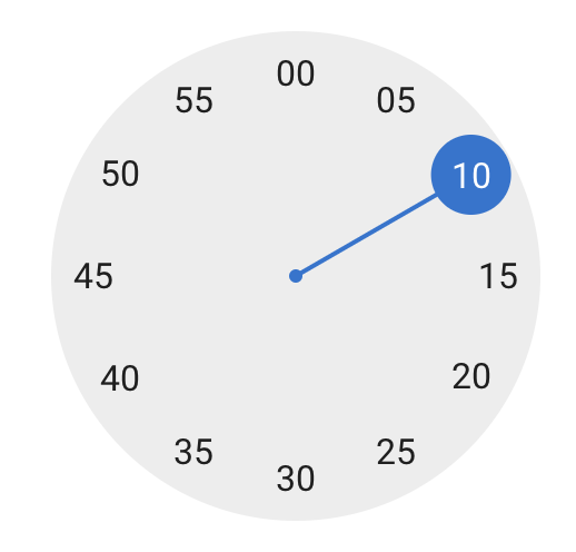
The clock picker, still present on mobile.
You can still use the Clock if you like to, but a replacement UI for the time picker is coming shortly after this release.
Shortcuts for picking specific dates in a calendar
You can now add quick and customizable shortcuts for your end-users. While shortcuts are an MIT licensed, it's particularly useful for date range pickers. You can display them on the left, right, bottom, or top.
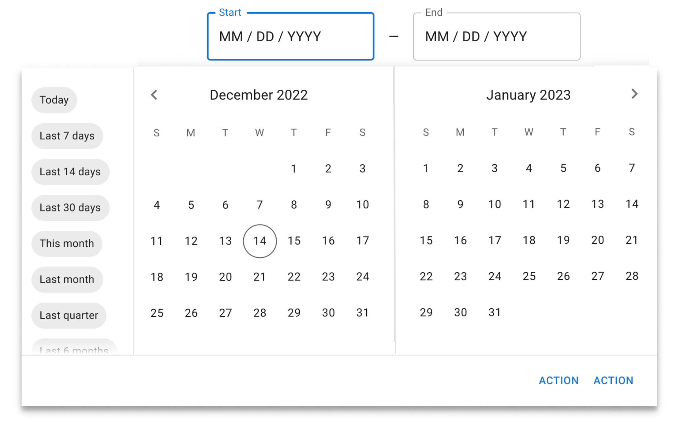
A demo of a Pro plan date range picker with shortcuts on the left.
Edit date ranges with drag and drop
Editing a date range is even easier now with the new drag-and-drop interaction. End-users can more easily change the start and end dates.
Installation and migration
If this is your first time using MUI X, you can jump in the getting started section:
If you're coming from previous versions, we recommend you check our migration guide from MUI X v5 with the complete list of breaking changes:
We also provide codemods to automate some of the necessary updates in your codebase.
npx @mui/x-codemod@latest v6.0.0/preset-safe <path>
What's next?
We operate in a continuous-delivery environment, so the plan is to keep rolling out new features in minor versions.
With the new base established in v6.0.0, we'll continue our efforts to improve UI/UX, bring more customization abilities, and support new use cases.
Here's a list of what you can expect to be delivered in the following months (what is next on our immediate roadmap).
Data Grid
- Clipboard importing (mui-x#199)
- Filtering on header (mui-x#6247)
- Row spanning (mui-x#207)
- Improved column management panel (column visibility, reordering, grouping, pinning, etc.) (mui-x#5700)
- Improved filter panel (mui-x#6419)
- Support for Joy UI
Date Pickers
- Time Picker replacement for the clock on desktop (mui-x#4483)
- Time Range Picker (mui-x#4460)
- Date Time Range Picker (mui-x#4547)
- Ability to select a month range in the Date Range Picker (mui-x#4995)
- Support for Joy UI
Charts 📊
- Preview of chart components 🔥 (mui-x#1408)
You can get more details of our next steps in MUI X public roadmap.
Decoupling versions from MUI Core
We have decoupled MUI X's versioning from MUI Core (including @mui/material: Material UI). We understand that this may cause confusion, so we'd like to explain the main reasons why we're moving in this direction:
Soften migration pains with a yearly release cycle.
The MUI X codebase is dynamic, and the constant development of new features often requires a faster breaking changes pace than MUI Core. With a yearly release, we aim to deliver those in smaller, more digestible sizes, in a time window that you can rely on to make your plans and prepare for updates.We aim to support not only Material UI but also Joy UI and, in the future, Base UI.
Feedback
We appreciate all of your feedback throughout the development of this new version. It's been vital for our process and always will be, so please continue to share your thoughts as we work through our next steps.
We're continuously doing user interviews, so if you'd like to share your pain points and use cases, please leave your contact info. As usual, you're welcome to join the discussion by requesting or commenting on new features, or reporting bugs in our GitHub repository.
Cheers!