Introducing MUI X v5
We are excited to introduce MUI X v5.0.0!
MUI X is our collection of advanced components (with both MIT and commercially licensed "Pro" features). Currently, it only includes a data grid. Soon it will include more components like date picker and tree view. This release continues our focus on making the data grid the best in the industry. Read on to learn more!

This release features some major highlights:
- High-level goals for v5
- A new virtualization engine
- Improved state management
- Simplified style customization
- v4 migration
- What's next?
- Thank you
High-level goals for v5
We develop different React components in two areas: MUI Core and MUI X. This approach recognizes that the problems solved by the components in these two products are different. The paths to success require different strategies. Many of the developers using MUI X also use Material UI, Base UI, and MUI System, these users care a lot about consistency (design, docs, dependencies, etc.).
With the release of MUI Core v5 two months ago MUI X had to work on providing a cohesive experience. The primary objective of this new major is to have MUI X provide a great compatibility with MUI Core v5.
A new virtualization engine
DataGrid and DataGridPro now feature a brand-new virtualization engine!
We decided to rewrite it to address the many issues raised by the community and to make it easier to release new features that impact the rendering of rows and columns.
An advantage over the previous version is that we now use the native scroll.
This means that scrolling the grid is like scrolling a webpage,
so any jittering caused when the scroll is overridden is gone.
Talking about performance, one of the main problems we had was that scrolling horizontally was laggy compared to vertical scrolling.
After investigation we found that, although the columns were virtualized, a lot of unnecessary renders were occurring.
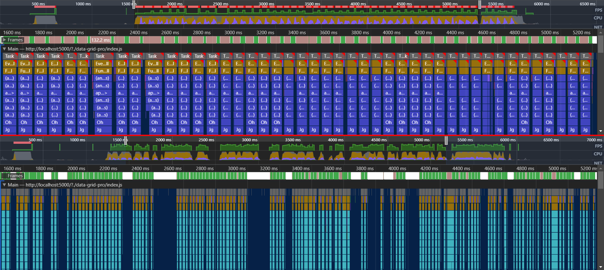
This can be seen in the top part of the screenshot below, where it compares v5.0.0-beta.4 (the last version before the new virtualization engine) with v5.0.0.
On each scroll event it renders again, and each frame takes a long time to be drawn (some are even lost).
To address these problems, we took the following actions:
- Avoid rendering the entire grid during scroll.
- Pass the correct value to the
keyprop to ensure that React will reuse the existing DOM nodes. - Reduced the number of event listeners attached to each cell.
- Increased the number of columns rendered in the overscan (the extra columns rendered to make scroll smoother).
- Delay the rendering of new columns whenever possible.
The result of these changes is shown in the bottom part of the comparison. The number of frames that could be drawn in the same amount of time dramatically increased, compared to the previous virtualization approach. In our benchmark, the FPS (frames per second) went from 22 to 42, on average. The time each frame takes to be rendered, indicated by the width of each block, was reduced.
The idea of delaying the re-rendering also can be seen in the large voids between the blocks. Each void means that a re-render was not necessary since the required columns were already rendered by the overscan.

Some of the mentioned improvements were also applied to the rows, however the gains were more subtle. Besides the better performance, the new virtualization engine also brings the following fixes:
- Horizontal and vertical scroll share the same logic.
- No more jumps when changing the rendered rows.
- Calling
apiRef.current.scrollToIndexesworks no matter where the cell is. - Improved support for when
disableVirtualizationis used. - Fixes keyboard navigation with arrow keys.
Improved state management
Several enhancements were made to state management to improve developer experience, performance, and consistency in the execution order.
Improved DX when using the state
We have worked on simplifying the state structure and the tools to access it.
These changes improved the developer experience when using the apiRef methods:
- We removed the
statestructure from the public API. Access to data in the state should always be done throughapiRefmethods (apiRef.current.getSelectedRows) or selectors (selectedGridRowsSelector). - We renamed most selectors to have a consistent naming convention, making it easier to deduce their name or infer purpose.
- We restructured our state so that each feature has a single sub-state, and the feature hook is the only one to update it (for example
state.filteris only managed by theuseGridFilterhook, which exposes methods for both internal and 3rd party code to interact with this state).
The work on this topic isn't over. We have several developments in progress or under discussion to improve the developer experience when using the advanced features of the grid. Here are a few that should be release in the following months:
- Strict typing of event listeners and publishers.
- Examples for the event listeners.
- Documentation and examples for selectors.
- Add the ability to export and restore some parts of the grid state.
Synchronous state initialization
In previous versions, the state was first populated with default values, and then in a useEffect, given the values provided as props (props.pageSize for instance), or derived from the props (the sorted and filtered rows derived from the props.rows, props.sortModel and props.filterModel).
This was causing an additional render with useless data, and then we had to be careful to avoid flickering between the fake and real data.
In v5, the state is initialized synchronously during the first render.
Note that for now, the state updates coming from controlled props are still asynchronous.
If you pass props.pageSize, we will apply it to the state in a useEffect, and therefore if you read the state just after the render (for instance in a useLayoutEffect), you will still see the old version.
Simplified style customization
In previous versions, most of the built-in CSS of the DataGrid and DataGridPro components had a CSS specificity of 2.
This means that the CSS you would normally add would have less priority than the built-in CSS of the data grid.
This was requiring you to open your dev tools, look at the DOM/CSSOM tree in order to use the correct CSS selector.
With MUI X v5 we have reduced the CSS specificity of most of the internal DataGrid and DataGridPro components to 1.
This enables developers to more easily change the look and feel of the grid's components.
Before
const GridToolbarContainerStyled = styled(GridToolbarContainer)({
  '&.MuiDataGrid-toolbarContainer': {
    padding: 40,
  },
});

function MyCustomToolbar() {
  return <GridToolbarContainerStyled>My custom toolbar</GridToolbarContainerStyled>;
}

export default function App() {
  return (
    <div style={{ height: 400, width: '100%' }}>
      <DataGrid components={{ Toolbar: MyCustomToolbar }} />
    </div>
  );
}
After
const GridToolbarContainerStyled = styled(GridToolbarContainer)({
  padding: 40,
});

function MyCustomToolbar() {
  return (
    <GridToolbarContainerStyled>
      My custom toolbar
    </GridToolbarContainer>
  );
};

export default function App() {
  return (
    <div style={{ height: 400, width: '100%' }}>
      <DataGrid components={{ Toolbar: MyCustomToolbar }} />
    </div>
  );
}
Another way to customize this will be to use the sx prop.
function MyCustomToolbar() {
  // means "padding: theme.spacing(5)", NOT "5px"
  return (
    <GridToolbarContainer sx={{ p: 5 }}>My custom toolbar</GridToolbarContainer>
  );
}

export default function App() {
  return (
    <div style={{ height: 400, width: '100%' }}>
      <DataGrid components={{ Toolbar: MyCustomToolbar }} />
    </div>
  );
}
Limitations
Although this was a clear improvement, we still had to keep a CSS specificity of 2 for some parts of the DataGrid and DataGridPro, specifically the GridColumnHeaderItem, GridRow and GridCell along with all of the components that are nested in them.
This is due to performance implications related to how Emotion injects styles into the page,
and was necessary to keep the performance of our virtualization engine at its optimal.
v4 migration
We strongly recommend you migrate MUI X to v5.
In MUI X v5 we have not only added additional features but also made significant internal improvements and performance optimizations that won't be included in v4.
All-new DataGrid and DataGridPro features will be only available in MUI X v5.
Please check the v4 migration guide to accelerate the transition.
What's next?
More exciting things are coming! We have big plans for the rest of this quarter in terms of features we expect to release in both the DataGrid and DataGridPro components.
Features such as tree data, column pinning, and variable row height are part of our roadmap.
Public roadmap
As a general rule, the data grid is the cornerstone of any application manipulating large amounts of data. We plan to focus on it as long as necessary to deliver most of the advanced features.
Once we would have grown the team and made enough progress, we will expand to more components.
You can view our public roadmap on GitHub to learn about what features we're working on, what stage they're at, and when we expect to bring them to you.
Thank you
Finally, one last thank you to everyone who's contributed to MUI X v5. We're very excited about this release, and we'll continue to push forward and deliver the next generation of Enterprise React UI components! It's just the beginning.