Why you should migrate to Material UI v5 today
Sam Sycamore
@samuelsycamoreAre you still using Material UI v4 in 2022?
What are you thinking?! 😛 Don't get left behind!
We released v5 in late 2021, and since then, we've seen a steady migration of users over to the new packages. This is exciting for us, because we're super proud of all the improvements that were shipped with v5.
But it seems as though a fair share of users are still hesitant to make the jump. This could be because v5 contains many breaking changes from v4, so the migration can be a large undertaking.
That's why we've completely revamped our v4 -> v5 migration guide—to help reduce the amount of friction you might encounter when updating to v5.
We hope it helps! Be sure to check out the updated migration guide in the Material UI docs.
Why you should upgrade to v5
Here are the top 5 reasons why you should upgrade to v5 ASAP.
1. React 18 support
Material UI v5 is the only version that fully supports React 18, so you'll need to update if you want to take advantage of the latest and greatest React features.
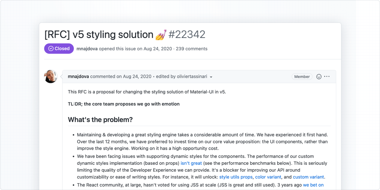
2. New style engine
One of the biggest changes in v5 is the replacement of JSS with Emotion as the default style engine. This offers significant advancements in performance when it comes to dynamic styles, and we also believe that it leads to a much more enjoyable developer experience.
Emotion unlocks many new customization options that developers had been requesting for years, such as custom style utility props, color variants, and custom theme variants. Check out this RFC on GitHub for details about this change.
Keep in mind that the new style engine is 100% incrementally adoptable: you can use JSS and Emotion together in the same app while migrating your components over.
3. Better customization tools
Material UI v5 introduces the sx prop, which opens up a whole new realm of possibility for applying custom styles.
Now you can apply style rules to individual components without needing to involve the styled() API, which would be overkill when dealing with one-off styles.
The sx prop lets you work with a superset of CSS, making it very intuitive to pick up and start using if you're already comfortable with CSS.
import * as React from 'react';
import Box from '@mui/material/Box';

export default function BoxSx() {
  return (
    <Box
      sx={{
        width: 300,
        height: 300,
        backgroundColor: 'primary.dark',
        '&:hover': {
          backgroundColor: 'primary.main',
          opacity: [0.9, 0.8, 0.7],
        },
      }}
    />
  );
}
4. IntelliSense prop descriptions
All prop descriptions are now written in TypeScript, which means that you can access details about the usage of a given prop right inside of your IDE—no need to seek out the official documentation to find this information.
5. Upcoming CSS variables support
CSS variables will help us solve a lot of customization issues in the future. One of them is the dark mode flashing issue that has been requested for a long time.
More importantly, this feature is opt-in if you are using Material UI v5! You can check out the progress on this effort in this GitHub issue.
Upgrade now
What are you waiting for? Jump into the newly revised migration documentation and get started today.
Let us know if you have any questions along the way!