Date and Time Pickers revamped
José Freitas
@joserodolfofreitasThere's a lot of exciting news in MUI X v6.0.0-beta.0, but there's hardly anything comparable to the revamp we're delivering for the Date and Time Pickers.
This is the result of our ongoing efforts to improve the usability and customizability of these components. We kept the best aspects of the previous versions, and we're fleshing out the package with new documentation, major new features, and one fundamental change: a new input type to replace the masked text fields.
The new date and time fields
These new input components are called Fields, and they provide massive improvements to the experience of editing the value with a keyboard.
The previous generation of pickers, whose text input is based on a mask approach, are often cumbersome and fall flat on edge cases as well simple cases like modifying dates.
For example, watch what happens when we edit the month on this masked input:
As you can notice, the day and year leak to the previous sections of the date, presenting a serious challenge to usability.
In contrast, the new fields are specialized in editing date and time values. They recognize the values on the input (day, month, year, etc.) and respond accordingly.
The Fields are included in the pickers, but they're also available as standalone components. You can import them from the latest v6 package.
import { DateField } from '@mui/x-date-pickers/DateField';

<DateField label="My first field" />;
They're by default used in the new Pickers (you don't need to declare a text field anymore).
import { DatePicker } from '@mui/x-date-pickers/DatePicker';

<DatePicker label="My first v6 picker" />;
Enhanced keyboard usability
With the new Fields, the keyboard interaction is a first-class experience. Not only can you type the date as text, but you can also use arrow keys to navigate and edit date and time values.
For a quick comparison, let's check out how the old and new approaches behave in typical scenarios.
Moreover, notice in the following example that as we edit the day, the component automatically navigates only in valid values.
Please, try it out for yourself in the live demo below.
Fields roadmap
The Fields are still in beta, and there are many improvements on the way. The following list describes some of the most notable features planned.
- Smart pasting
Date strings pasted in Fields will be parsed and matched with the sections of the date. - Support days of the week
Users will be able to select a day in the week just like the can select a month.
We'd love to hear your feedback to help us improve these components even further.
Other significant improvements
Now that you've seen what's fundamentally changed with the Pickers, let's briefly review some other noteworthy improvements.
Customization of layout and internal components
Combining the concept of slots with the grid layout, you now can rearrange, extend, and customize most of the components used internally by the Pickers' views.Default render input
You don't need to provide the usualTextFieldonrenderInputanymore unless you need it customized. In which case you can do it by:- Customizing through props via
fieldandinputslots (codebox example). - Build a new field component using the Field's headless API (documentation coming soon).
- Use an entirely custom text field to suit your use case.
- Customizing through props via
Drag to edit
Editing a date range is even easier now with the new drag-and-drop interface. Changestartandenddates at will.Range shortcuts (available from v6.0.0-beta.1)
Add quick and customizable shortcuts for your users. Choose to display them on the left, right, bottom or top.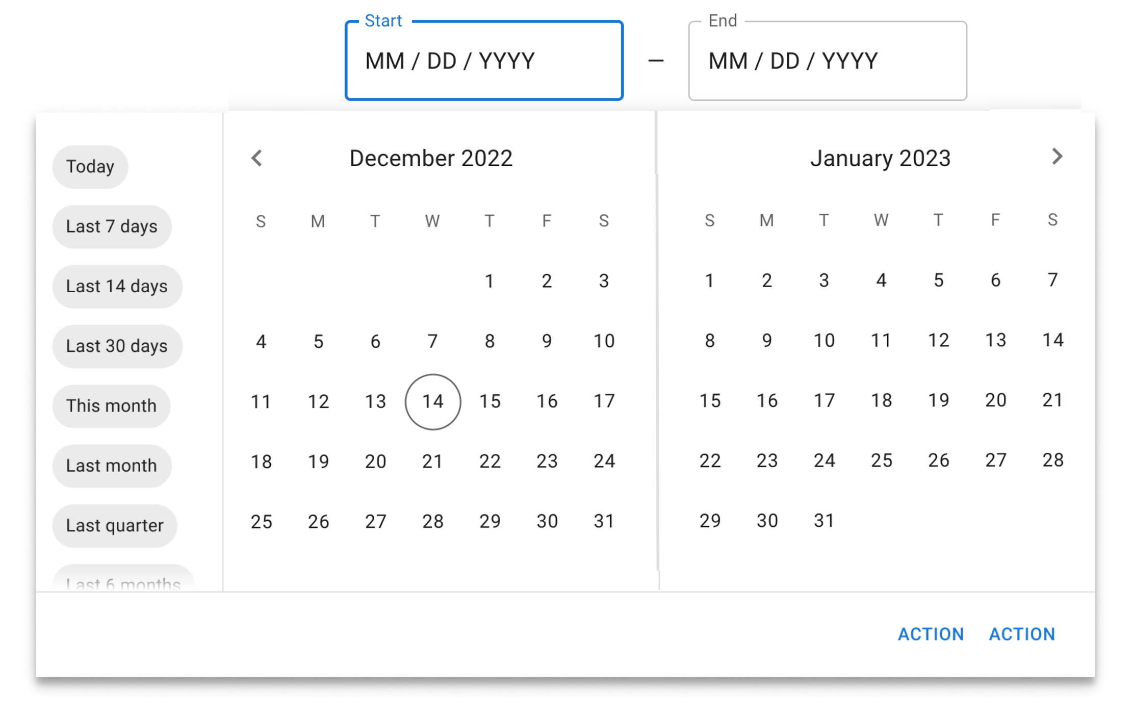
Should we retire the masked inputs?
We believe that after using the date fields, you'll have no reason to come back to the masked input approach. It has a few irreparable usability issues, and it sets some hard limits on what we can do with the input.
Our plan is to replace them entirely, but you can help us steer our roadmap.
If you want to voice your opinions or get involved, please consider scheduling a user interview with us.
As always, you can get in touch by opening new bug reports or feature requests in our GitHub repository.