MUI X v7 is now in beta
It's the end of January, and we're ready to start rolling out some of the plans for 2024! We have new components, exciting features, and a lot of improvements for both developers and end-users.
Starting now, MUI X v7 is in beta. Most breaking changes are in place, and we shift our focus towards refining and expanding over the new version.
Table of contents
Data Grid
We have introduced critical breaking changes designed not only to enhance the developer experience but also to bring the user experience to a new level.
Sticky headers
The column headers and pinning implementations have been refactored for an improved user experience. You'll notice a more responsive Data Grid with smoother horizontal scrolling and better screen reader support. The video below showcases some of these improvements.
Improved columns panel design
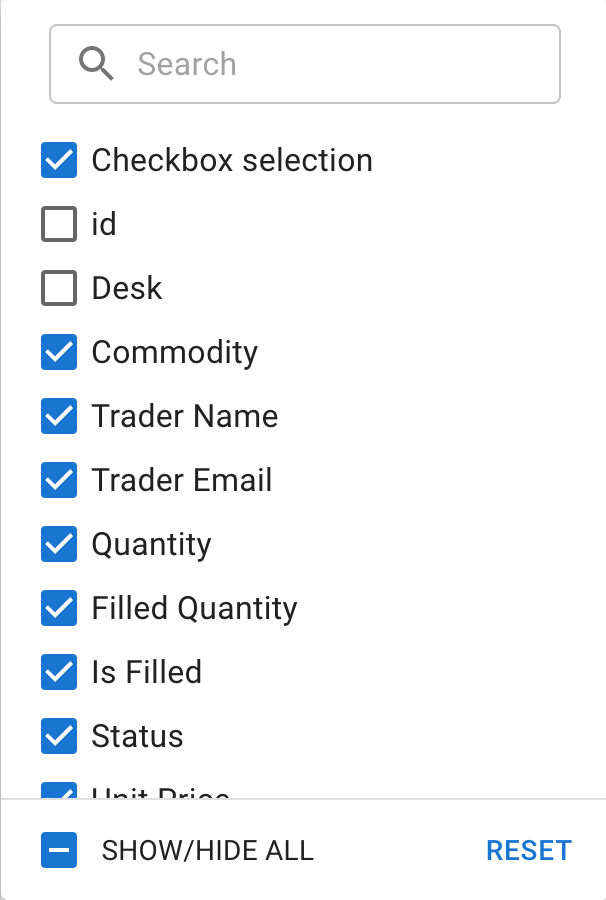
The column management panel now features a sleeker, checkbox-based design, replacing the previous toggle button style. Additionally, we've extracted the internal component to facilitate the introduction of the upcoming pivoting UI.

Date Object support in filter model
The filterModel now supports Date objects for date and dateTime column types, providing a more intuitive and efficient filtering experience.
While string values remain compatible for these types, any updates to the filterModel made through the UI (such as via the filter panel) will now automatically use Date objects, ensuring consistency and ease of data handling.
Smaller bundle size
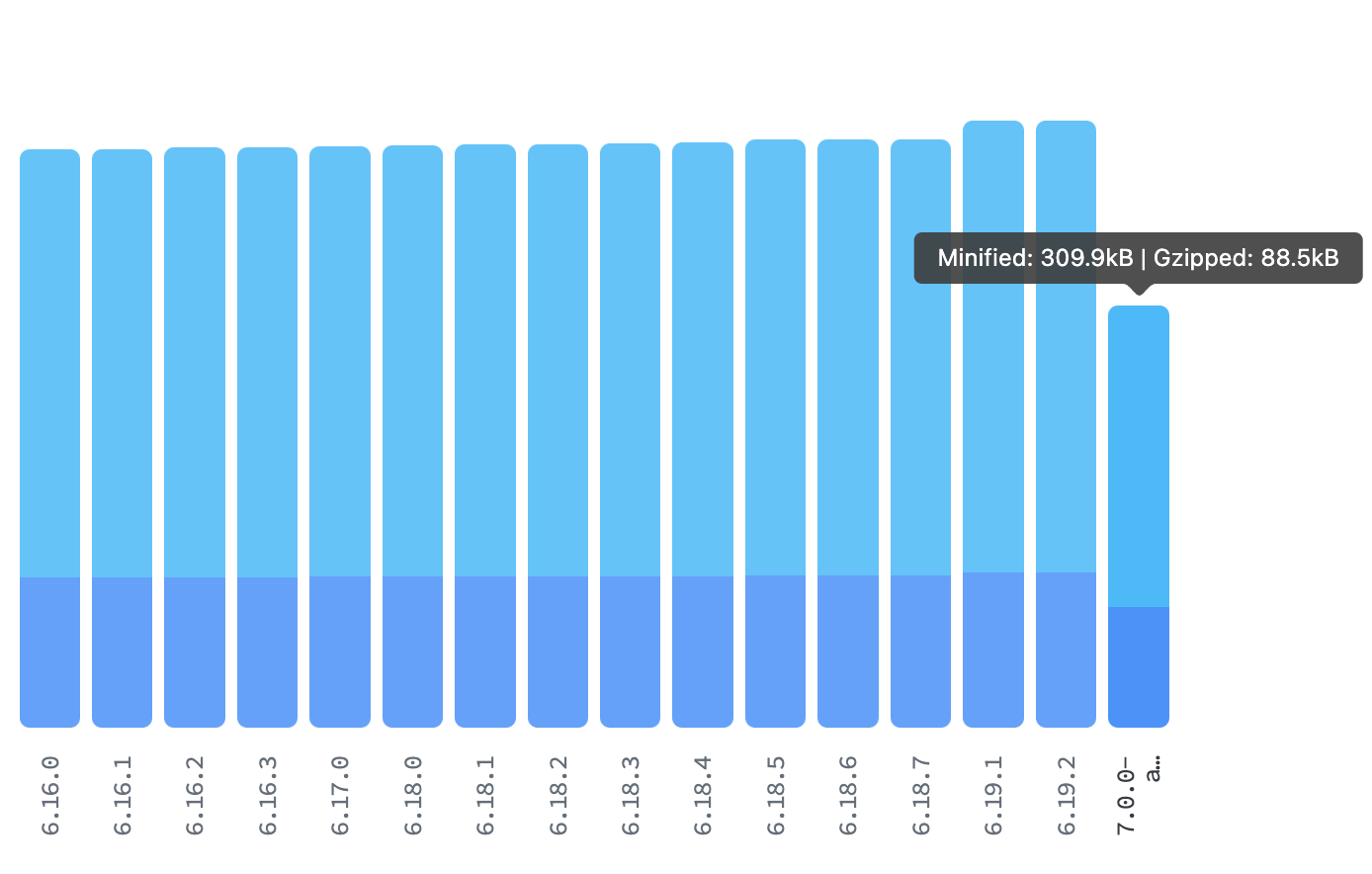
The introduction of a separate entry point for locales has significantly reduced the bundle size of the barrel index when tree-shaking isn't operational (for example webpack in dev mode).
For example with the @mui/x-data-grid npm package, this change led to a reduction of approximately 22% – shrinking the bundle size from 114.2kB to 88.5kB.

New stable features
During major version updates, MUI X introduces new features under the experimentalFeatures flag or using the unstable_ prefix.
This approach serves as a failsafe in case there's a need to change the API based on user feedback.
We're excited to announce that the following features have been promoted to stable:
Tree View
Following the promotion of the component from the labs to MUI X, our primary focus has been on improving its developer experience. This includes efforts to clarify documentation and improve key examples, making them more informative and user-friendly.
A particularly significant initiative is the time-saving alternative to the traditional JSX architecture, the RichTreeView.
RichTreeView
We've split the Tree View into two distinct components.
The first is the SimpleTreeView, which retains the classic and familiar JSX approach and is still the one behind the original <TreeView /> tag.
The second is the RichTreeView, a new variant designed to streamline the development process, and with which we aim to support several common use cases out-of-the-box.
Similar to the Data Grid, it requires only a dataset and possibly a few properties to render; it does all the heavy lifting for you, handling most of the complexities internally.
const myDataSet = [
  {
    id: 'node-1',
    label: 'Node 1',
    children: [
      { id: 'node-1-1', label: 'Node 1.1' },
      { id: 'node-1-2', label: 'Node 1.2' },
    ],
  },
  {
    id: 'node-2',
    label: 'Node 2',
  },
];
<RichTreeView items={myDataSet} multiSelect />
Check out the new component!
Charts
Since the initial stable release of MUI X Charts a few months ago, we have been diligently listening to your feedback and focusing on refining the foundational charts to ensure they effectively cater to your diverse use cases. This includes bug fixes, documentation improvements, and support for more complex scenarios.
Reference line
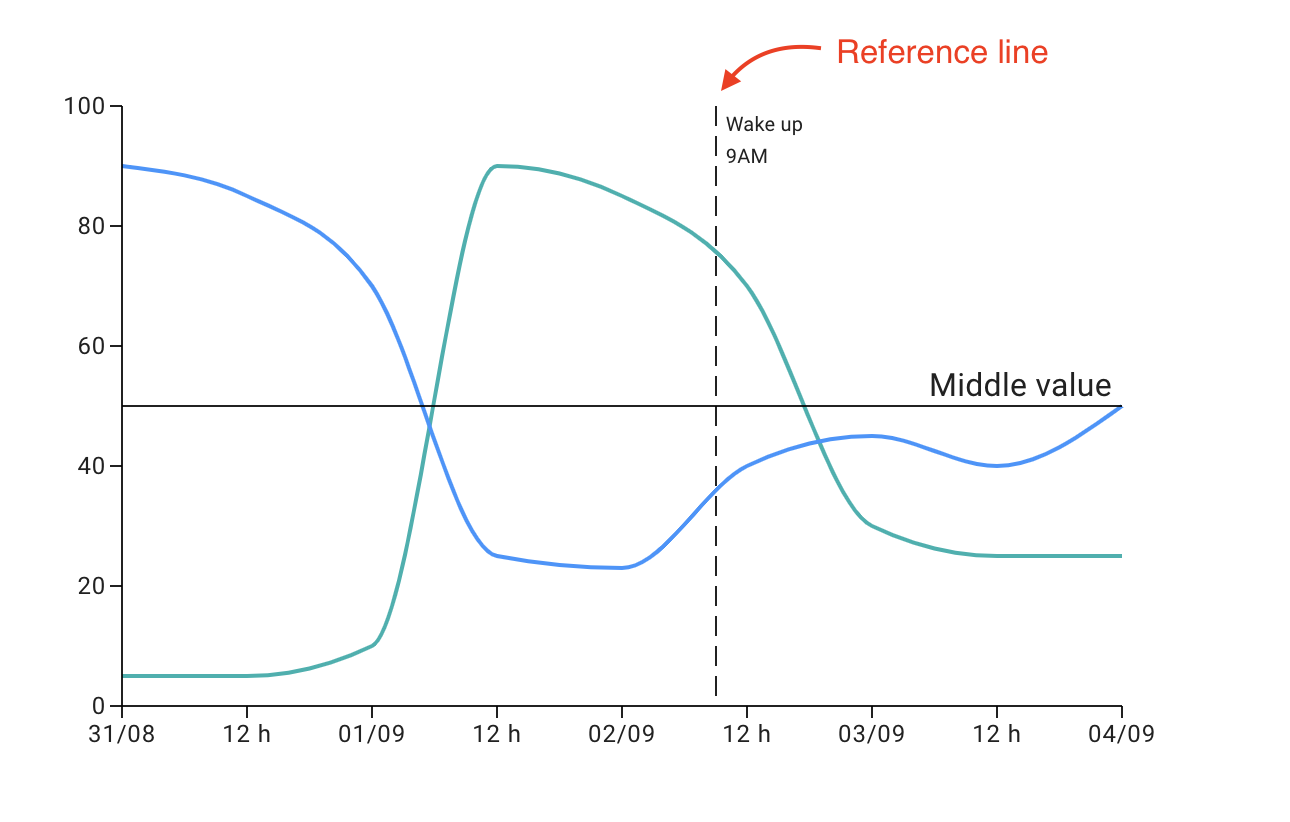
The ChartsReferenceLine component enhances data visualization, providing users with a clear reference to better understand and analyze key data points.

You can find more details on its documentation.
Date and Time Pickers
The focus has been mostly on developing the highly anticipated new components, DateTimeRangePicker and TimeRangePicker, alongside a significant effort to enhance accessibility in the fields, ensuring that our components are as inclusive and user-friendly as possible.
While our journey towards these new additions continues, our commitment to improving existing features remains a top priority. Accordingly, we consistently update existing components to align seamlessly with the latest versions of supported date libraries.
Date Time Range Picker
Support new use cases with this most anticipated component.
The latest addition to the Date and Time Pickers suite is the <DateTimeRangePicker />, a component designed to enrich the user experience with advanced date and time selection.
This intuitive picker simplifies the process of selecting date and time ranges, making it ideal for applications that require detailed scheduling or period selection.
Learn how to use and customize the new component now!
Support for date-fns v3
The Date and Time Pickers now support both versions of v2 and v3 of date-fns and you can select your desired version from one of the two import lines:
// date-fns v2.x
import { AdapterDateFns } from '@mui/x-date-pickers/AdapterDateFns';
// date-fns v3.x
import { AdapterDateFns } from '@mui/x-date-pickers/AdapterDateFnsV3';
What's next
As we approach the stable release of v7, our roadmap is well-defined, focusing on delivering key enhancements and features either just before or within a couple of weeks following the stable version's launch.
Data Grid
Tree View
Charts
Date and Time Pickers
- TimeRangePicker
- Field with improved accessibility
Migration guide
We fully understand that updating a dependency library can sometimes be daunting. To smooth the transition to the new version, we have documented all breaking changes in our migration guides:
These component-specific guides are reference pages designed to assist you if you encounter any challenges while updating to the new major version. It's our way of making the upgrade process more manageable and less burdensome for you. However, should you need further assistance, please don't hesitate to contact us and send your feedback.
How to get involved
Your feedback has been invaluable in developing MUI X, and we're always happy to hear from you. Please consider sharing your experiences and pain points by:
- Giving us a user interview.
- Reporting bugs and suggesting features on our GitHub repository.
We look forward to your input!
