An introduction to the MUI ecosystem
Sam Sycamore
@samuelsycamore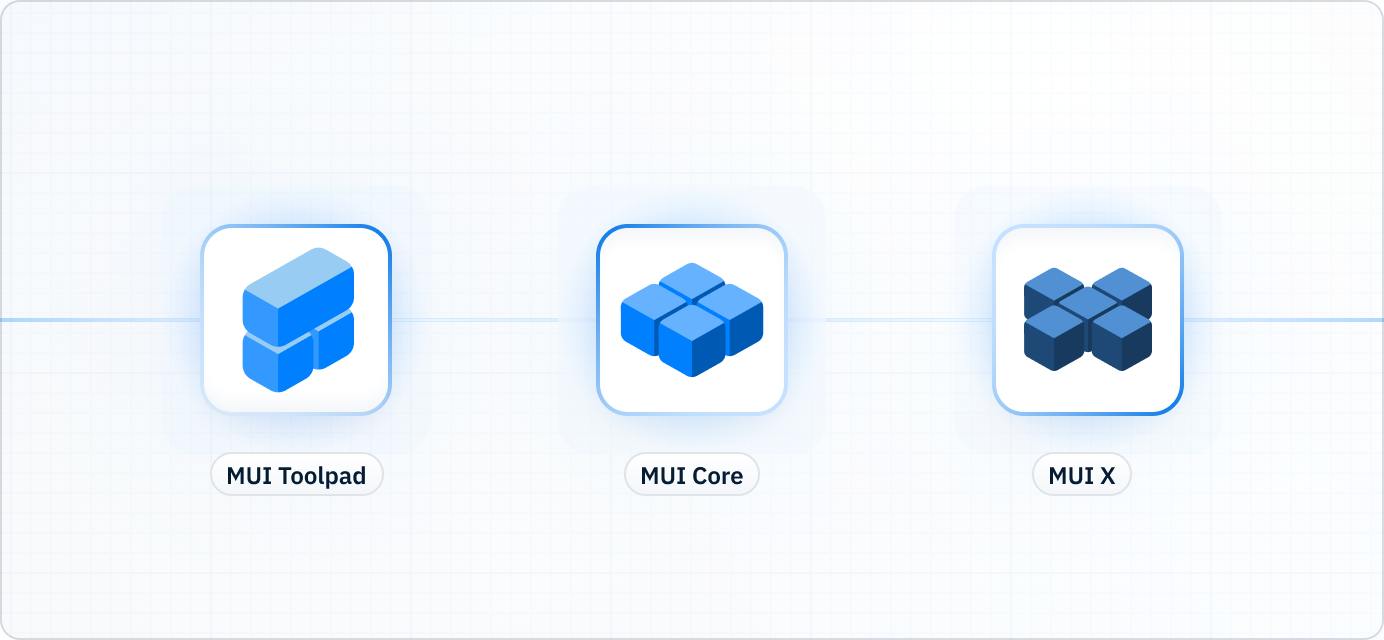
MUI is so much more than Material UI!
You'll be forgiven if you thought MUI was merely shorthand for our most popular product. In fact, MUI as an organization was founded to meet the growing needs of the Material UI community, and is now responsible for a whole suite of related products.
Material UI is the flagship; but it's also the gateway to MUI's ever-expanding ecosystem of UI tools.
Though our roots are in Material Design, we're branching out well beyond those constraints these days to deliver a wider range of tools for developers to ship new features faster.
Our primary offerings fall into two product lines: Core and X. MUI Core contains our foundational component libraries (like Material UI), while MUI X offers components that are significantly more complex (like the Data Grid).
We're also in the early stages of developing a low-code internal tool builder called Toolpad, which enables you to build with every Core and X component in a drag-and-drop interface.
Read on for more details on each of our products.
MUI Core
The Core is MUI's foundational product line.
It grew out of Material UI, and that library's legacy lives on in the name of the repo on GitHub: mui/material-ui.
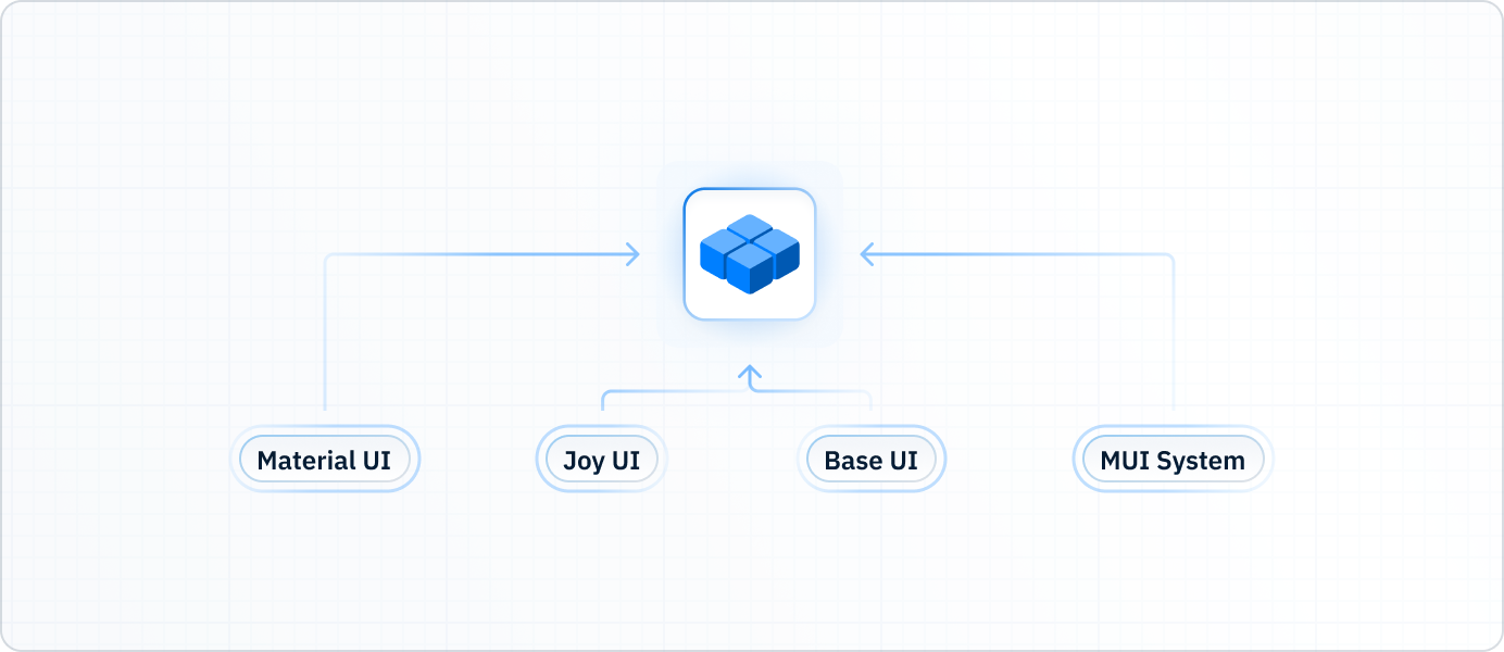
But this repo contains much more than just Material UI these days. We've carefully deconstructed this library to expose its best parts as isolated open-source projects. More recent additions include Joy UI and Base UI, as well as our in-house styling solution, MUI System.
MUI Core is open-source, and we invite you to contribute wherever you see fit!
Material UI
Material UI is an open-source React component library that implements Google's Material Design. It includes a comprehensive collection of prebuilt components that are ready for use in production right out of the box.
Material UI is beautiful by design and features a suite of customization options that make it easy to implement your own custom design system on top of our components.
Get started in the Material UI docs.
Key features
- Material Design: Your app will look and feel excellent by default, thanks to our meticulous implementation of Material Design (currently M2; M3 is on the way).
- Comprehensiveness: With over 50 foundational components and counting, you've got everything you need to ship new features fast.
- Maturity: Material UI's age and maturity rival that of React itself, with its origins spanning all the way back to 2014.
- Community: Over 2,500 open-source contributors have made this library what it is today.
Ideal use cases
- User interfaces that adhere closely to Material Design.
- Internal admin tools.
- Dev teams that need to ship features in hours rather than weeks.
Joy UI
Joy UI is an open-source React component library that implements MUI's own in-house design principles. It's intended to serve as an alternative to Material UI for designs that don't adhere to Material Design specifications.
Try Joy UI if you appreciate the comprehensiveness and reliability of Material UI, but don't need all of the additional baggage that comes along with Material Design.
Get started in the Joy UI docs.
Key features
- Innovative design: Free from the constraints of Material Design, Joy UI is where we can innovate and experiment with fresh new ideas in design, UX, and DX.
- Flexibility: Customize with ease, and leverage the power of CSS variables to ensure consistency when making pixel-perfect adjustments.
Ideal use cases
- Projects that don't involve Material Design.
- Design systems that would benefit from less opinionated defaults when customizing.
- Client-facing apps that need to look and feel distinctly like your brand.
Base UI
Base UI is an open-source library of headless ("unstyled") React UI components and hooks. These components were extracted from Material UI, and are now available as a standalone package. They feature the same robust engineering but without any default styling solution or theme.
Base UI includes prebuilt components with production-ready functionality, along with low-level hooks for transferring that functionality to other components.
Get started in the Base UI docs.
Key features
- Total control over styles: Unlike Material UI and Joy UI, Base UI doesn't ship with any default styles or styling solution. Write CSS however you'd prefer—vanilla, modules, styled-components—or integrate a styling library like Tailwind CSS or Emotion.
- Hooks for fully custom components: When pre-built components aren't flexible enough, low-level hooks enable you to quickly add sophisticated functionality to your custom components.
- Accessibility: Base UI components are built with accessibility in mind. We do our best to make all components screen reader-friendly, and offer suggestions for optimizing accessibility throughout our documentation.
- The core of MUI Core: Base UI serves as the scaffold for Joy UI components, and future versions Material UI will also be built with Base UI as the foundation.
Ideal use cases
- Implementing fully custom designs.
- Creating custom components within a Material UI or Joy UI app.
- Adding functionality to fully custom components.
MUI System
MUI System is a set of CSS utilities to help you build custom designs more efficiently when working with MUI component libraries like Material UI, Joy UI, and Base UI.
The System gives you a set of flexible, generic wrapper components like Box and Container that can be quickly customized using the sx prop.
This prop lets you define styles directly within the components themselves, rather than creating bulky and redundant const definitions with styled-components.
It also gives you direct access to your theme's custom design tokens to ensure consistency in one-off styles.
Get started in the MUI System docs.
Key features
- Faster prototyping: The
sxprop lets you apply styles directly to a component by writing the CSS you already know. This makes it a great tool for quickly assembling a prototype or styling a one-off component that doesn't need to be reused. - Write less code:
sxlets you avoid writing unnecessary styled-components code, and as such it can replace dozens of lines of code. Check out Why use MUI System? for an example.
Ideal use cases
- Quickly prototyping custom styles in Material UI, Joy UI, or Base UI.
- Creating one-off custom components.
MUI X
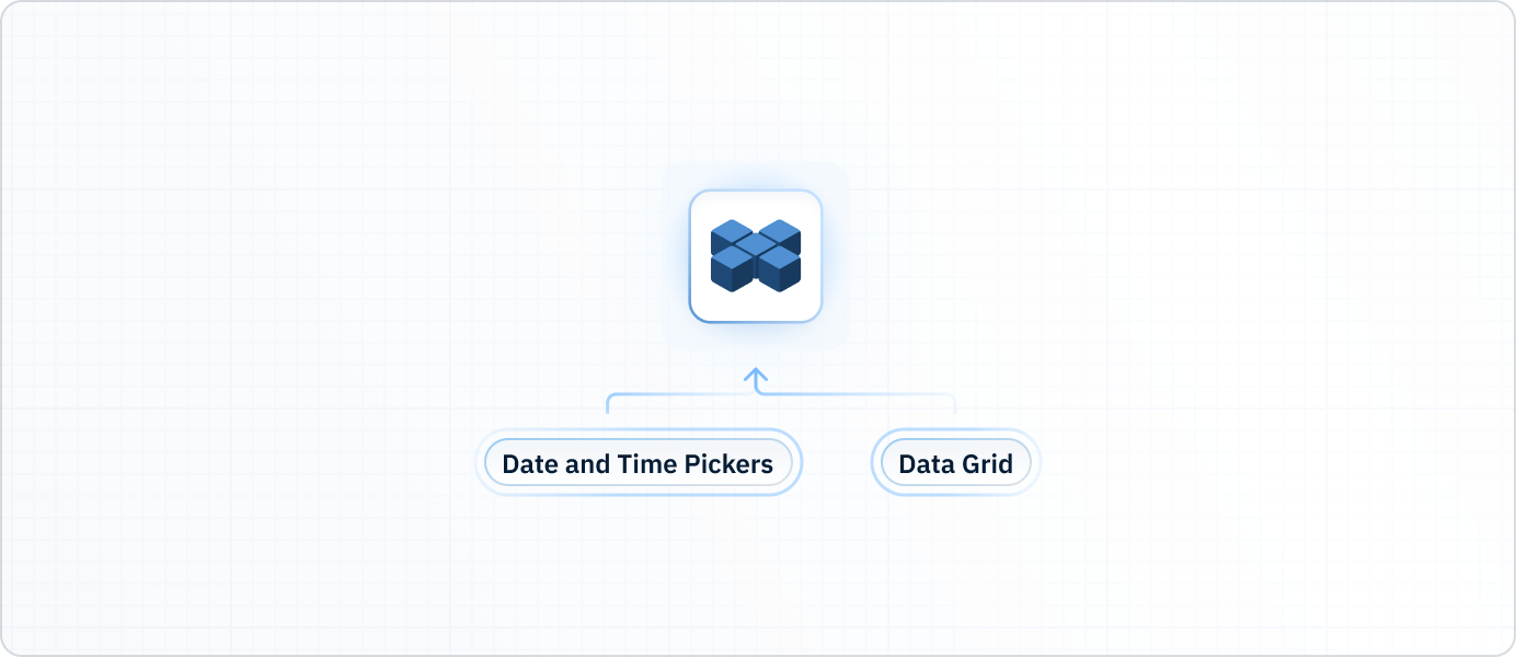
MUI X is a collection of advanced UI components, including the Data Grid and the Date and Time Pickers.
These components are significantly more complex than those found in the MUI Core libraries. They feature advanced functionality for data-rich applications and a wide range of other use cases. While X components natively integrate with MUI Core, they are kept separate so you can more easily implement custom design systems with them.
MUI X is open-core. Base components are MIT-licensed, while more advanced features require a Pro or Premium commercial license. See Licensing for details.
Data Grid
The MUI X Data Grid is a fast and extensible React data table with advanced features for power users and complex use cases in data management and analysis. It features an intuitive UI and corresponding API to display different views of a data set, with support for real-time updates, accessibility, theming, and custom templates.
Key features
- Data management: Create, retrieve, update and delete your data with ease.
- Sophisticated data analysis: Pin rows and columns, group and aggregate values, export your view of the data to other formats. MUI X's Data Grid is one of the most feature-rich grids available on the market today.
- Intuitive customization: Customizing the Data Grid's styles and behaviors works just like you'd expect if you're familiar with Material UI—no new concepts to master along the way.
- Accessibility: It's notoriously difficult to optimize a data grid's accessibility, which is precisely why we make it a top priority—we obsess over these details so you don't have to.
Ideal use cases
- Applications that feature massive data sets.
- Data analytics tools inside your app, reducing the need to jump to Excel.
- Apps built with MUI Core libraries that need advanced functionality.
Date and Time Pickers
The MUI X Date and Time Pickers are a collection of React UI components that let users select dates and times from dialogs and text fields. Components include the Date Picker, Time Picker, Date Range Picker, and Date Time Picker, with more on the way.
Key features
- Third-party date library support: All components include support for many of the most popular date libraries, so you can pick whichever you prefer.
- Localization: The Pickers are optimized for use anywhere in the world, with support for all variations on date and time formatting.
Ideal use cases
- Forms requiring date and time input from the user.
- Booking apps using date and time ranges.
- Enterprise apps using advanced date and time validation with constraints.
- Apps built with MUI Core libraries that need date and time functionality.
Toolpad
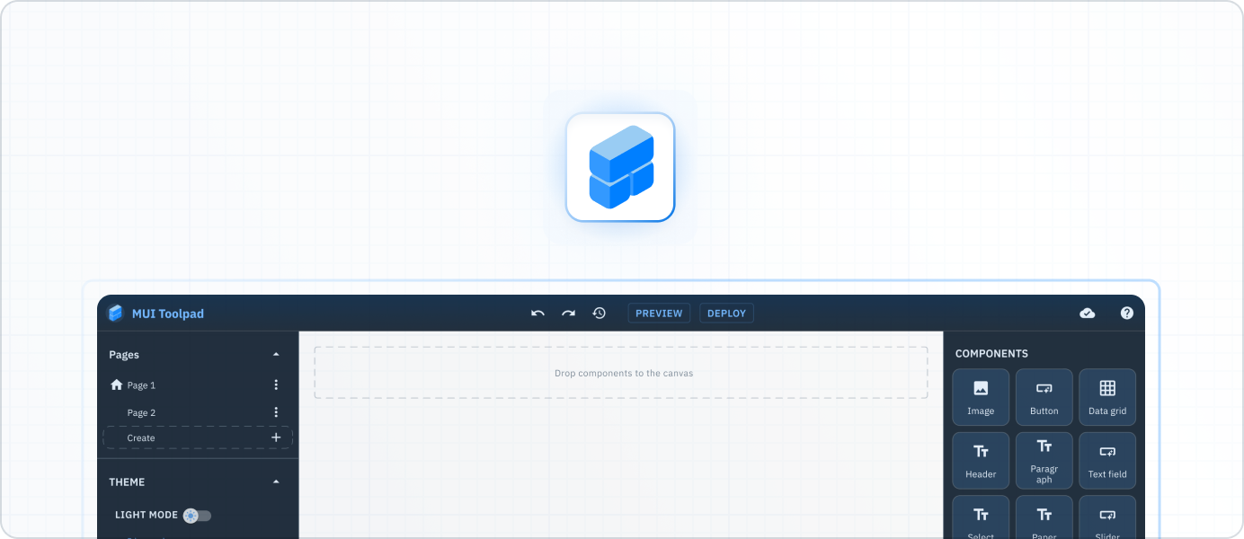
Toolpad is a self-hosted low-code admin builder designed to extend MUI's suite of React components. It's designed for developers of all trades who want to save time building internal applications. Drag and drop pre-built UI components, connect your data sources, and your app is ready for deployment.
Key features
- Build faster than ever: With Toolpad, your development time can be measured in minutes rather than hours or days. Skip the mindless busywork of UI development and get straight to the core business logic.
- Use the components you already know: Toolpad comes preloaded with both MUI Core and X libraries, giving you the full power of MUI's components in a drag-and-drop interface.
- Extensible with code: Start with only bare-bones JavaScript to get up and running, and then jump from "low code" to "pro code" as needed to add custom features and functionality.
Ideal use cases
- Admin tools with a tight deadline.
- Rapid in-browser prototyping for front-end and full-stack development.
What comes next
MUI is firmly committed to the React ecosystem for the long term—our company mission is measured in decades, because we believe in the staying power of this open-source community.
We envision a world in which MUI's component libraries are the industry standard for React developers worldwide, and we've defined some ambitious goals for growth to make this a reality in the years to come.
To keep up with all of our new products and features, you can sign up for our mailing list at the bottom of this page to receive monthly updates.
We can't wait to see what you create!