Material UI v6 is out now 🎉
Aarón García
@aarongarciah
Brijesh Bittu
@brijeshb42
Diego Andai
@DiegoAndai
Marija Najdova
@mnajdova
Romain Gregoire
@romgrk
Sam Sycamore
@samuelsycamore
Siriwat Kunaporn
@siriwatknp
Victor Zanivan Monteiro
@zanivanMaterial UI v6 is now stable—just in time to celebrate 10 years since our initial commit! It comes with new features, improvements, and an experimental integration for static CSS extraction.
Table of contents
- New features
- Improvements
- Experimental CSS extraction via Pigment CSS
- React 19 support
- Full-stack apps via Toolpad Core
- Get started with Material UI v6
New features
CSS theme variables
CSS variables have become an industry standard for the web.
Material UI v6 introduces a new cssVariables flag that generates CSS variables from serializable theme values such as palette, spacing, and typography.
const theme = createTheme({ cssVariables: true, ... });
| Light colors | Dark colors | Font | Overlay | Shadow | Spacing | Shape | z Index |
|---|---|---|---|---|---|---|---|
| --mui-common-black | --mui-common-black | --mui-font-h1 | --mui-overlays-0 | --mui-shadows-0 | --mui-spacing | --mui-shape-borderRadius | --mui-zIndex-mobileStepper |
| --mui-common-white | --mui-common-white | --mui-font-h2 | --mui-overlays-1 | --mui-shadows-1 | --mui-zIndex-fab | ||
| --mui-common-background | --mui-common-background | --mui-font-h3 | --mui-overlays-2 | --mui-shadows-2 | --mui-zIndex-speedDial | ||
| --mui-common-onBackground | --mui-common-onBackground | --mui-font-h4 | --mui-overlays-3 | --mui-shadows-3 | --mui-zIndex-appBar | ||
| --mui-common-backgroundChannel | --mui-common-backgroundChannel | --mui-font-h5 | --mui-overlays-4 | --mui-shadows-4 | --mui-zIndex-drawer | ||
| --mui-common-onBackgroundChannel | --mui-common-onBackgroundChannel | --mui-font-h6 | --mui-overlays-5 | --mui-shadows-5 | --mui-zIndex-modal | ||
| --mui-primary-main | --mui-primary-main | --mui-font-subtitle1 | --mui-overlays-6 | --mui-shadows-6 | --mui-zIndex-snackbar | ||
| --mui-primary-light | --mui-primary-light | --mui-font-subtitle2 | --mui-overlays-7 | --mui-shadows-7 | --mui-zIndex-tooltip | ||
| --mui-primary-dark | --mui-primary-dark | --mui-font-body1 | --mui-overlays-8 | --mui-shadows-8 | |||
| --mui-primary-contrastText | --mui-primary-contrastText | --mui-font-body2 | --mui-overlays-9 | --mui-shadows-9 | |||
| --mui-primary-mainChannel | --mui-primary-mainChannel | --mui-font-button | --mui-overlays-10 | --mui-shadows-10 | |||
| --mui-primary-lightChannel | --mui-primary-lightChannel | --mui-font-caption | --mui-overlays-11 | --mui-shadows-11 | |||
| --mui-primary-darkChannel | --mui-primary-darkChannel | --mui-font-overline | --mui-overlays-12 | --mui-shadows-12 | |||
| --mui-primary-contrastTextChannel | --mui-primary-contrastTextChannel | --mui-font-inherit | --mui-overlays-13 | --mui-shadows-13 | |||
| --mui-secondary-main | --mui-secondary-main | --mui-overlays-14 | --mui-shadows-14 | ||||
| --mui-secondary-light | --mui-secondary-light | --mui-overlays-15 | --mui-shadows-15 | ||||
| --mui-secondary-dark | --mui-secondary-dark | --mui-overlays-16 | --mui-shadows-16 | ||||
| --mui-secondary-contrastText | --mui-secondary-contrastText | --mui-overlays-17 | --mui-shadows-17 | ||||
| --mui-secondary-mainChannel | --mui-secondary-mainChannel | --mui-overlays-18 | --mui-shadows-18 | ||||
| --mui-secondary-lightChannel | --mui-secondary-lightChannel | --mui-overlays-19 | --mui-shadows-19 | ||||
| --mui-secondary-darkChannel | --mui-secondary-darkChannel | --mui-overlays-20 | --mui-shadows-20 | ||||
| --mui-secondary-contrastTextChannel | --mui-secondary-contrastTextChannel | --mui-overlays-21 | --mui-shadows-21 | ||||
| --mui-error-main | --mui-error-main | --mui-overlays-22 | --mui-shadows-22 | ||||
| --mui-error-light | --mui-error-light | --mui-overlays-23 | --mui-shadows-23 | ||||
| --mui-error-dark | --mui-error-dark | --mui-overlays-24 | --mui-shadows-24 | ||||
| --mui-error-contrastText | --mui-error-contrastText | ||||||
| --mui-error-mainChannel | --mui-error-mainChannel | ||||||
| --mui-error-lightChannel | --mui-error-lightChannel | ||||||
| --mui-error-darkChannel | --mui-error-darkChannel | ||||||
| --mui-error-contrastTextChannel | --mui-error-contrastTextChannel | ||||||
| --mui-warning-main | --mui-warning-main | ||||||
| --mui-warning-light | --mui-warning-light | ||||||
| --mui-warning-dark | --mui-warning-dark | ||||||
| --mui-warning-contrastText | --mui-warning-contrastText | ||||||
| --mui-warning-mainChannel | --mui-warning-mainChannel | ||||||
| --mui-warning-lightChannel | --mui-warning-lightChannel | ||||||
| --mui-warning-darkChannel | --mui-warning-darkChannel | ||||||
| --mui-warning-contrastTextChannel | --mui-warning-contrastTextChannel | ||||||
| --mui-info-main | --mui-info-main | ||||||
| --mui-info-light | --mui-info-light | ||||||
| --mui-info-dark | --mui-info-dark | ||||||
| --mui-info-contrastText | --mui-info-contrastText | ||||||
| --mui-info-mainChannel | --mui-info-mainChannel | ||||||
| --mui-info-lightChannel | --mui-info-lightChannel | ||||||
| --mui-info-darkChannel | --mui-info-darkChannel | ||||||
| --mui-info-contrastTextChannel | --mui-info-contrastTextChannel | ||||||
| --mui-success-main | --mui-success-main | ||||||
| --mui-success-light | --mui-success-light | ||||||
| --mui-success-dark | --mui-success-dark | ||||||
| --mui-success-contrastText | --mui-success-contrastText | ||||||
| --mui-success-mainChannel | --mui-success-mainChannel | ||||||
| --mui-success-lightChannel | --mui-success-lightChannel | ||||||
| --mui-success-darkChannel | --mui-success-darkChannel | ||||||
| --mui-success-contrastTextChannel | --mui-success-contrastTextChannel | ||||||
| --mui-grey-50 | --mui-grey-50 | ||||||
| --mui-grey-100 | --mui-grey-100 | ||||||
| --mui-grey-200 | --mui-grey-200 | ||||||
| --mui-grey-300 | --mui-grey-300 | ||||||
| --mui-grey-400 | --mui-grey-400 | ||||||
| --mui-grey-500 | --mui-grey-500 | ||||||
| --mui-grey-600 | --mui-grey-600 | ||||||
| --mui-grey-700 | --mui-grey-700 | ||||||
| --mui-grey-800 | --mui-grey-800 | ||||||
| --mui-grey-900 | --mui-grey-900 | ||||||
| --mui-grey-A100 | --mui-grey-A100 | ||||||
| --mui-grey-A200 | --mui-grey-A200 | ||||||
| --mui-grey-A400 | --mui-grey-A400 | ||||||
| --mui-grey-A700 | --mui-grey-A700 | ||||||
| --mui-text-primary | --mui-text-primary | ||||||
| --mui-text-secondary | --mui-text-secondary | ||||||
| --mui-text-disabled | --mui-text-disabled | ||||||
| --mui-text-icon | --mui-text-icon | ||||||
| --mui-text-primaryChannel | --mui-text-primaryChannel | ||||||
| --mui-text-secondaryChannel | --mui-text-secondaryChannel | ||||||
| --mui-divider | --mui-divider | ||||||
| --mui-background-paper | --mui-background-paper | ||||||
| --mui-background-default | --mui-background-default | ||||||
| --mui-background-defaultChannel | --mui-background-defaultChannel | ||||||
| --mui-background-paperChannel | --mui-background-paperChannel | ||||||
| --mui-action-active | --mui-action-active | ||||||
| --mui-action-hover | --mui-action-hover | ||||||
| --mui-action-hoverOpacity | --mui-action-hoverOpacity | ||||||
| --mui-action-selected | --mui-action-selected | ||||||
| --mui-action-selectedOpacity | --mui-action-selectedOpacity | ||||||
| --mui-action-disabled | --mui-action-disabled | ||||||
| --mui-action-disabledBackground | --mui-action-disabledBackground | ||||||
| --mui-action-disabledOpacity | --mui-action-disabledOpacity | ||||||
| --mui-action-focus | --mui-action-focus | ||||||
| --mui-action-focusOpacity | --mui-action-focusOpacity | ||||||
| --mui-action-activatedOpacity | --mui-action-activatedOpacity | ||||||
| --mui-action-activeChannel | --mui-action-activeChannel | ||||||
| --mui-action-selectedChannel | --mui-action-selectedChannel | ||||||
| --mui-Alert-errorColor | --mui-Alert-errorColor | ||||||
| --mui-Alert-infoColor | --mui-Alert-infoColor | ||||||
| --mui-Alert-successColor | --mui-Alert-successColor | ||||||
| --mui-Alert-warningColor | --mui-Alert-warningColor | ||||||
| --mui-Alert-errorFilledBg | --mui-Alert-errorFilledBg | ||||||
| --mui-Alert-infoFilledBg | --mui-Alert-infoFilledBg | ||||||
| --mui-Alert-successFilledBg | --mui-Alert-successFilledBg | ||||||
| --mui-Alert-warningFilledBg | --mui-Alert-warningFilledBg | ||||||
| --mui-Alert-errorFilledColor | --mui-Alert-errorFilledColor | ||||||
| --mui-Alert-infoFilledColor | --mui-Alert-infoFilledColor | ||||||
| --mui-Alert-successFilledColor | --mui-Alert-successFilledColor | ||||||
| --mui-Alert-warningFilledColor | --mui-Alert-warningFilledColor | ||||||
| --mui-Alert-errorStandardBg | --mui-Alert-errorStandardBg | ||||||
| --mui-Alert-infoStandardBg | --mui-Alert-infoStandardBg | ||||||
| --mui-Alert-successStandardBg | --mui-Alert-successStandardBg | ||||||
| --mui-Alert-warningStandardBg | --mui-Alert-warningStandardBg | ||||||
| --mui-Alert-errorIconColor | --mui-Alert-errorIconColor | ||||||
| --mui-Alert-infoIconColor | --mui-Alert-infoIconColor | ||||||
| --mui-Alert-successIconColor | --mui-Alert-successIconColor | ||||||
| --mui-Alert-warningIconColor | --mui-Alert-warningIconColor | ||||||
| --mui-AppBar-defaultBg | --mui-AppBar-defaultBg | ||||||
| --mui-AppBar-darkBg | --mui-AppBar-darkBg | ||||||
| --mui-AppBar-darkColor | --mui-AppBar-darkColor | ||||||
| --mui-Avatar-defaultBg | --mui-Avatar-defaultBg | ||||||
| --mui-Button-inheritContainedBg | --mui-Button-inheritContainedBg | ||||||
| --mui-Button-inheritContainedHoverBg | --mui-Button-inheritContainedHoverBg | ||||||
| --mui-Chip-defaultBorder | --mui-Chip-defaultBorder | ||||||
| --mui-Chip-defaultAvatarColor | --mui-Chip-defaultAvatarColor | ||||||
| --mui-Chip-defaultIconColor | --mui-Chip-defaultIconColor | ||||||
| --mui-FilledInput-bg | --mui-FilledInput-bg | ||||||
| --mui-FilledInput-hoverBg | --mui-FilledInput-hoverBg | ||||||
| --mui-FilledInput-disabledBg | --mui-FilledInput-disabledBg | ||||||
| --mui-LinearProgress-primaryBg | --mui-LinearProgress-primaryBg | ||||||
| --mui-LinearProgress-secondaryBg | --mui-LinearProgress-secondaryBg | ||||||
| --mui-LinearProgress-errorBg | --mui-LinearProgress-errorBg | ||||||
| --mui-LinearProgress-infoBg | --mui-LinearProgress-infoBg | ||||||
| --mui-LinearProgress-successBg | --mui-LinearProgress-successBg | ||||||
| --mui-LinearProgress-warningBg | --mui-LinearProgress-warningBg | ||||||
| --mui-Skeleton-bg | --mui-Skeleton-bg | ||||||
| --mui-Slider-primaryTrack | --mui-Slider-primaryTrack | ||||||
| --mui-Slider-secondaryTrack | --mui-Slider-secondaryTrack | ||||||
| --mui-Slider-errorTrack | --mui-Slider-errorTrack | ||||||
| --mui-Slider-infoTrack | --mui-Slider-infoTrack | ||||||
| --mui-Slider-successTrack | --mui-Slider-successTrack | ||||||
| --mui-Slider-warningTrack | --mui-Slider-warningTrack | ||||||
| --mui-SnackbarContent-bg | --mui-SnackbarContent-bg | ||||||
| --mui-SnackbarContent-color | --mui-SnackbarContent-color | ||||||
| --mui-SpeedDialAction-fabHoverBg | --mui-SpeedDialAction-fabHoverBg | ||||||
| --mui-StepConnector-border | --mui-StepConnector-border | ||||||
| --mui-StepContent-border | --mui-StepContent-border | ||||||
| --mui-Switch-defaultColor | --mui-Switch-defaultColor | ||||||
| --mui-Switch-defaultDisabledColor | --mui-Switch-defaultDisabledColor | ||||||
| --mui-Switch-primaryDisabledColor | --mui-Switch-primaryDisabledColor | ||||||
| --mui-Switch-secondaryDisabledColor | --mui-Switch-secondaryDisabledColor | ||||||
| --mui-Switch-errorDisabledColor | --mui-Switch-errorDisabledColor | ||||||
| --mui-Switch-infoDisabledColor | --mui-Switch-infoDisabledColor | ||||||
| --mui-Switch-successDisabledColor | --mui-Switch-successDisabledColor | ||||||
| --mui-Switch-warningDisabledColor | --mui-Switch-warningDisabledColor | ||||||
| --mui-TableCell-border | --mui-TableCell-border | ||||||
| --mui-Tooltip-bg | --mui-Tooltip-bg | ||||||
| --mui-dividerChannel | --mui-dividerChannel |
After enabling the flag, you can access the variables from the theme.vars object with the same structure as the theme.
const CustomComponent = styled('div')(({ theme }) => ({
  backgroundColor: theme.vars.palette.background.default,
  color: theme.vars.palette.text.primary,
}));
Benefits
Improved developer experience—you can see where the values are coming from in the browser's dev tools.
Makes it possible to resolve the notorious dark mode SSR flickering issue.
CSS variables open many doors for integration—for example, you can work with a Material UI theme in a plain CSS file.
styles.css.custom-card { background-color: var(--mui-palette-background-default); color: var(--mui-palette-text-primary); padding: var(--mui-spacing-2); font: var(--mui-font-body1); }
Color schemes
Prior to v6, if you wanted to support light and dark modes, you would have to create two separate themes and handle the logic to switch between modes. This can be complex and error-prone.
Material UI v6 introduces the new colorSchemes node to simplify this process: With just one line of code, your application supports both light and dark modes instantly.
const theme = createTheme({ colorSchemes: { dark: true } });
// light is generated by default.

function App() {
  return <ThemeProvider theme={theme}>...</ThemeProvider>;
}
The colorSchemes node makes it possible for Material UI to support the following features out of the box:
- System preference detection
- Instant transitions between modes with the
disableTransitionOnChangeprop - Persistent user preferences via local storage
- Automatic synchronization of the selected mode across browser tabs
A hook for toggling between modes
The new useColorScheme hook lets you read and update the mode in your application.
import { useColorScheme } from '@mui/material/styles';

function ModeSwitcher() {
  const { mode, setMode } = useColorScheme();
  if (!mode) return null;
  return (
    <select onChange={(event) => setMode(event.target.value)}>
      <option value="system">System</option>
      <option value="light">Light</option>
      <option value="dark">Dark</option>
    </select>
  );
}
CSS media prefers-color-scheme
When CSS variables and color schemes are enabled, Material UI uses the prefers-color-scheme media query as the default method for generating CSS variables.
import { createTheme, ThemeProvider } from '@mui/material/styles';

const theme = createTheme({
  cssVariables: true,
  colorSchemes: { dark: true },
});

function App() {
  return <ThemeProvider theme={theme}>...</ThemeProvider>;
}
Container queries
Material UI v6 introduces a container query utility based on the existing theme.breakpoints API.
This feature lets you define styles based on the parent container's width instead of the viewport.
const Component = styled('div')(({ theme }) => ({
  display: 'flex',
  flexDirection: 'column',
  gap: theme.spacing(2),
  [theme.containerQueries.up('sm')]: {
    flexDirection: 'row',
  },
  [theme.containerQueries('sidebar').up('400px')]: {
    // @container sidebar (min-width: 400px)
    flexDirection: 'row',
  },
}));
It also works with the sx prop:
<Card
  sx={{
    '@sm': {
      flexDirection: 'row',
    },
    '@400/sidebar': {
      flexDirection: 'row',
    },
  }}
/>
New method of applying styles
The new API theme.applyStyles() has been added for creating specific mode styles.
It's designed to replace the theme.palette.mode === 'dark' condition to fix the SSR flickering issue when combined with the CSS theme variables feature.
const StyledInput = styled(InputBase)(({ theme }) => ({
  padding: 10,
  width: '100%',
  borderBottom: '1px solid #eaecef',
  ...theme.applyStyles('dark', {
    borderBottom: '1px solid #30363d',
  }),
  '& input': {
    borderRadius: 4,
    backgroundColor: '#fff',
    ...theme.applyStyles('dark', {
      backgroundColor: '#0d1117',
    }),
  },
}));Improvements
Optimized runtime performance
Several optimizations have been made to improve the runtime performance of Material UI v6.
This is just the beginning of our performance improvements. There are more optimizations in our pipeline, so stay tuned for further v6.x updates and the benchmark results.
Revamped free templates
Explore the new and improved free Material UI templates to see all of the new v6 features in action. We've fully revamped the templates to demonstrate some common real-world use cases for our components, and to provide the perfect starting point for your next project.

Custom styles
The new templates can be toggled between the default Material Design and a fully custom theme that's shared across the entire suite, so you can dig deep into the best approaches for component customization—or just grab the pieces you like best and start building from there.

Stabilized Grid v2
The Grid v2 component has been stabilized and now uses the CSS gap property for creating space between grid items. This is a huge improvement over the previous version, which used margins and padding to create space.
The responsive configuration has been consolidated into the size and offset props for consistency.
import Grid from '@mui/material/Grid2';

<Grid container>
  <Grid size={{ xs: 6, sm: 4, lg: 3 }} />
  <Grid size={{ xs: 6, sm: 4, lg: 3 }} />
  <Grid size={{ xs: 6, sm: 4, lg: 3 }} />
</Grid>;
Reduced package size
To align with React 19's removal of UMD builds, Material UI has also removed its UMD bundle.
This results in a reduction of the @mui/material package size by 2.5MB, or 25% of the total size in v5.
See Package Phobia for more details.
Instead of UMD, we recommend using ESM-based CDNs such as esm.sh.
For alternative installation methods, refer to the CDN documentation.
Experimental CSS extraction via Pigment CSS
Material UI v5 uses Emotion as its default styling solution. Because it's a runtime CSS-in-JS library, Emotion forces us to make compromises to performance and bundle size.
Material UI v6 introduces opt-in integration with Pigment CSS, our new zero-runtime styling library that eliminates the runtime overhead while preserving the API design patterns you already know and love.
React Server Components
Once integrated with Pigment CSS, Material UI v6 provides a separate set of layout components—Grid, Container, and Stack—that are compatible with React Server Components.
import Grid from '@mui/material-pigment-css/Grid';
import Container from '@mui/material-pigment-css/Container';
import Stack from '@mui/material-pigment-css/Stack';
Built-in sx prop support
With Pigment CSS integration, all JSX elements support the sx prop out of the box.
This means you no longer have to clutter the DOM with wrappers like Box or Stack in order to apply custom styles to a <div> or any other element with the sx prop.
-import Box from '@mui/material/Box';

-<Box component="img" sx={{ padding: 2 }} />
+<img sx={{ padding: 2 }} />
React 19 support
Material UI v6 is ready for React 19. We've been testing Material UI with the latest React 19 RC versions to ensure compatibility once the stable release of React 19 is out.
We're also working on backporting React 19 support to Material UI v5—stay tuned.
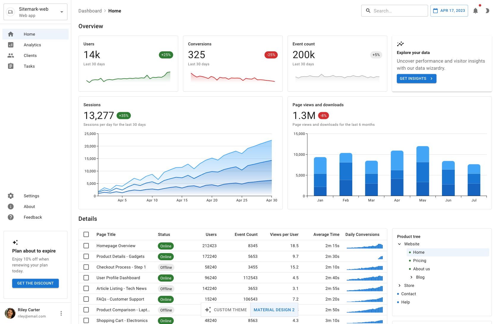
Full-stack apps via Toolpad Core
To help you build full-stack apps faster than ever, we're launching Toolpad Core, a framework for building dashboards and internal tools with Material UI and Next.js that comes with routing, layout components, and authentication already configured for you.
Stay tuned for more updates on Toolpad Core in the near future.
Get started with Material UI v6
Ready to upgrade to Material UI v6? Head to the v6 migration guide next.
Visit the links below for further details on some of the key features covered here: