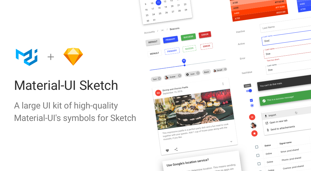
Introducing Material UI for Sketch
Olivier Tassinari
@oliviertassinariToday, we're excited to introduce the Sketch symbols 💎 for Material UI.
Available on our store
The UI kit contains all the Material UI components with states and variations which gives 1,500+ unique elements. All components are designed with the most up to date release.
We dream of a world where designers and developers can share the same tools. We wish to streamline the creation process of great UIs. This new product brings you one step closer to this long term goal. It enables designers to provide developers close to production "handoffs". It aims to maximize efficiency and consistency.
Why
Frequent requests
Over the last few months, we have seen a growing number of designers asking for these Sketch symbols. For instance, there is a Stack Overflow question with over 4,000 views. It has been a common request on X: one, two, three, etc.
No great alternatives
For a long time, we have ignored the problem. We were recommending users to try alternatives out. However, we realized that it wasn't a great answer. There were no good solutions out there:
- Sketch has some symbols for Material Design. Unfortunately, they cover <30% of the components available in Material UI, use an outdated version of the specification, and focus on mobile (leaving desktop behind).
- Material Design had a Sketch plugin. Unfortunately, it was recently retired, was supporting fewer components than Material UI, and didn't use the same wording/structure as Material UI that made it harder to move from design to implementation.
- Anything else is paid.
Gain efficiency
No matter what your role, you'll be more efficient with these assets:
UI / UX Designers 💅
Save time using this large library of UI components, icons and styles to deliver your work faster. You can customize the kit however you want to match your product's brand.
Product managers / Entrepreneurs 🧪
Create MVPs efficiently and save hundreds of hours on UI Design. This is a great place to start if your product or brand needs a design system. Equip your team with this library for Sketch and build consistent products faster.
Developers 🛠
Gain in autonomy, design beautiful, consistent and accessible interface without relying on designers. You can preview how it will look before coding it. The UI kit was created specifically for Material UI, a popular React UI library with a comprehensive set of components.
See it in action
The following video demonstrates how the symbols can be used to design an invoice page.
Sketch Cloud preview: https://mui.com/store/previews/sketch-react/.
More tools
According to a recent user survey ran by the Material Design Team, Sketch is the most popular tool used by teams to manage design systems. However, it's not the only tool.
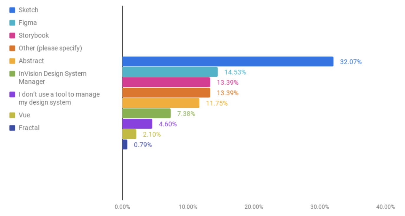
Popular tools used to manage Design Systems (n=1762)
We are working on the support of more popular tools. We have recently released the support of Framer X for Material UI. We plan to release the support of Figma in the coming weeks. You can subscribe to the newsletter of the store to be notified when available.
Features
You can learn more about the features available on the Sketch page details of the symbols.