Create a map component
You can extend Toolpad Studio with custom code components.
You can create a custom component to display any geographical map, like so:
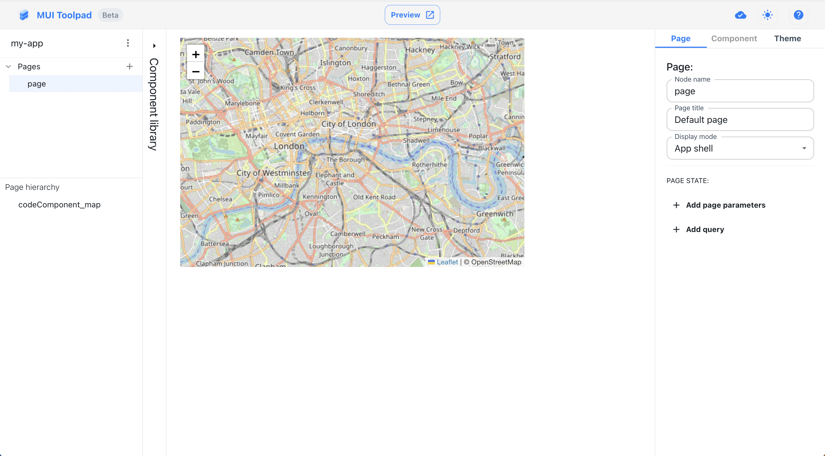
The map component
Creating the component
In the Toolpad Studio editor
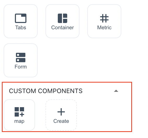
- To get started creating this, hover over the component library and click on the Create button in the Custom Components section.
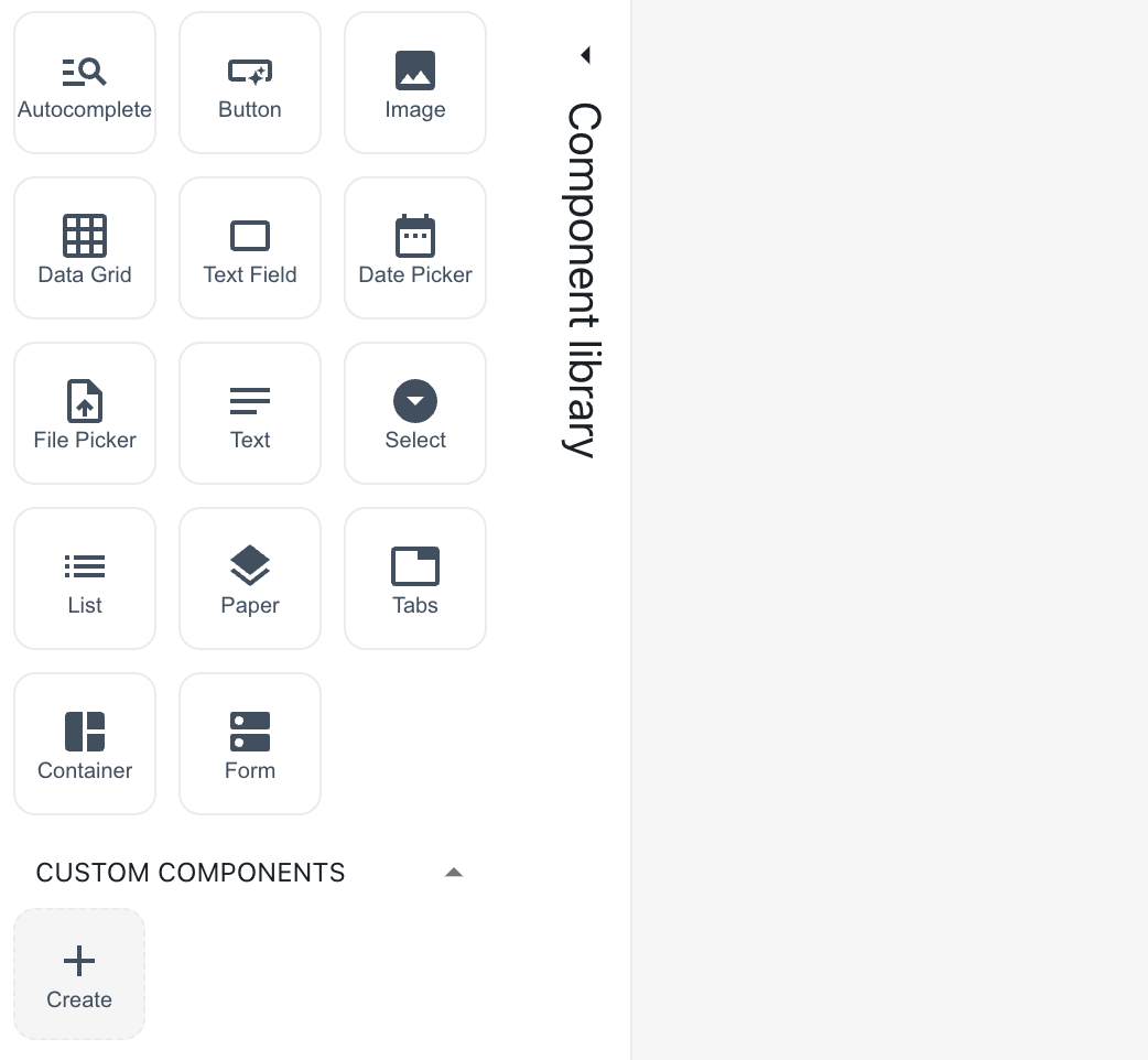
Create a custom component
A dialog box appears asking you to name it. Name it "Map".
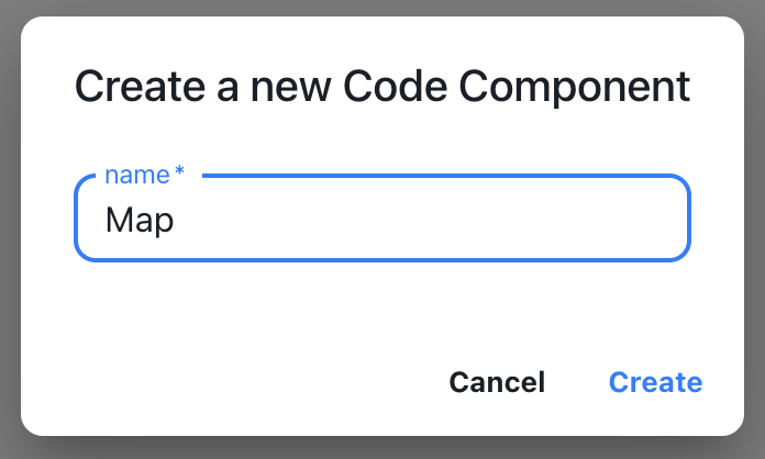
Naming a custom component
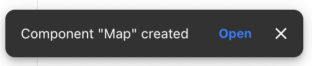
- A snackbar appears acknowledging the successful creation of the component. A starter file is created in
toolpad/components. Use the Open button to open this file in your code editor:
Open the custom component
In the code editor
- A file with some sample code for a custom component is initialised for you. Replace its content with the following code:
import * as React from 'react';
import { createComponent } from '@toolpad/studio/browser';
import * as L from 'leaflet';

export interface LeafletProps {
  lat: number;
  long: number;
  zoom: number;
}

async function createLeafletStyles(doc) {
  let styles = doc.getElementById('leaflet-css');
  if (styles) {
    return;
  }
  const res = await fetch('https://esm.sh/leaflet/dist/leaflet.css');
  if (!res.ok) {
    throw new Error(`HTTP ${res.status}: ${res.statusText}`);
  }
  const css = await res.text();
  styles = doc.createElement('style');
  styles.id = 'leaflet-css';
  styles.appendChild(doc.createTextNode(css));
  doc.head.appendChild(styles);
}

function Leaflet({ lat, long, zoom }: LeafletProps) {
  const root: any = React.useRef(null);
  const mapRef = React.useRef<any>();
  const [stylesInitialized, setStylesIitialized] = React.useState(false);
  const [error, setError] = React.useState<Error>();

  React.useEffect(() => {
    const doc = root.current.ownerDocument;
    createLeafletStyles(doc).then(
      () => setStylesIitialized(true),
      (err) => setError(err),
    );
  }, []);

  React.useEffect(() => {
    if (!mapRef.current && stylesInitialized) {
      mapRef.current = L.map(root.current);
      L.tileLayer('https://{s}.tile.openstreetmap.org/{z}/{x}/{y}.png', {
        maxZoom: 19,
        attribution: '© OpenStreetMap',
      }).addTo(mapRef.current);
    }

    if (mapRef.current) {
      mapRef.current.setView([lat, long], zoom);
    }
  }, [stylesInitialized, lat, long, zoom]);

  return (
    <div style={{ height: 400, width: 600 }}>
      {error ? (
        error.message
      ) : (
        <div style={{ width: '100%', height: '100%' }} ref={root} />
      )}
    </div>
  );
}

export default createComponent(Leaflet, {
  argTypes: {
    lat: {
      type: 'number',
      defaultValue: 51.505,
    },
    long: {
      type: 'number',
      defaultValue: -0.09,
    },
    zoom: {
      type: 'number',
      defaultValue: 13,
    },
  },
});
label and value are the props that you will make available for binding in the Toolpad Studio editor.
- MapDisplay is now available as a custom component in the component library:
The map component appears in the component library
Using the component
- Drag two of the map components on the canvas and select the first one. In the inspector, you'll see both the
labelandvalueproperties available as bindable properties.
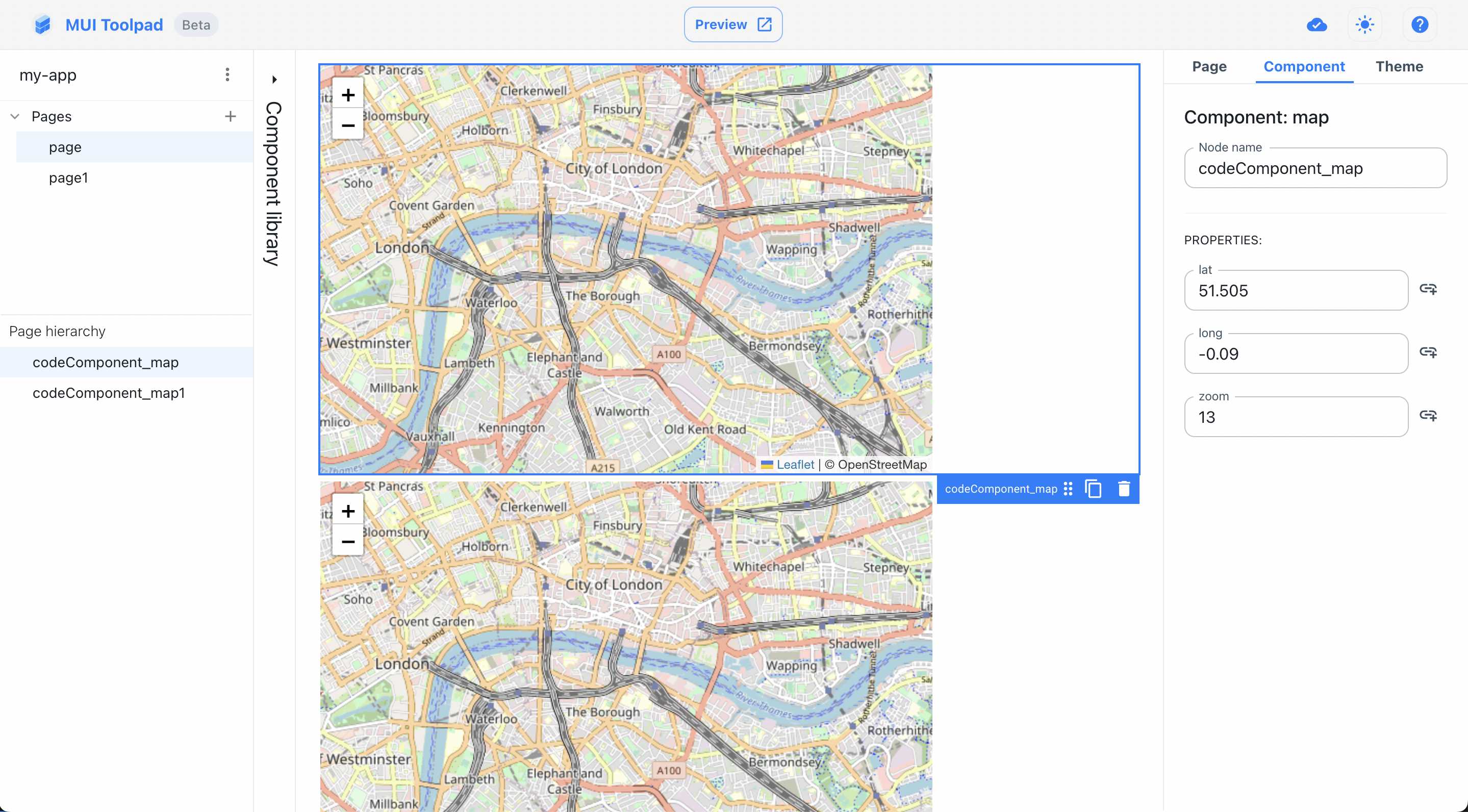
Using the map component