Create a 3D cube component
You can extend Toolpad Studio with custom code components, including from external packages.
You can use any package available on npm to extend your Toolpad Studio application. This guide will render a cube using @react-three/fiber:
The cube component
Creating the component
In the Toolpad Studio editor
To get started creating this, add the requisite libraries to your Toolpad Studio app, using
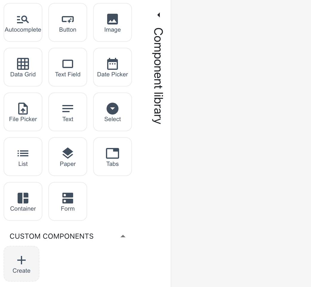
yarn add three @react-three/fiberThen, hover over the component library and click on the Create button in the Custom Components section.
Create a custom component
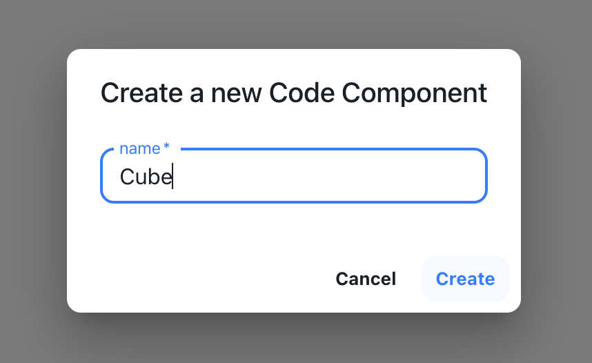
A dialog box appears asking you to name it. Name it "Cube".
Naming the cube component
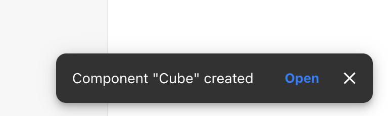
- A snackbar appears acknowledging the successful creation of the component. A starter file is created in
toolpad/components. Use the Open button to open this file in your code editor:
Open the cube component
In the code editor
A file with some sample code for a custom component is initialised for you. Replace its content with the following code:
import * as React from 'react';
import { Canvas, useFrame } from '@react-three/fiber';
import { createComponent } from '@toolpad/studio/browser';

function Box({ position, color }) {
  // This reference gives us direct access to the THREE.Mesh object
  const ref = React.useRef();
  // Hold state for hovered and clicked events
  const [hovered, hover] = React.useState(false);
  const [clicked, click] = React.useState(false);
  // Subscribe this component to the render-loop, rotate the mesh every frame
  useFrame((state, delta) => {
    if (!ref.current) return;
    ref.current.rotation.x += delta;
  });
  // Return the view, these are regular Threejs elements expressed in JSX
  return (
    <mesh
      position={position}
      ref={ref}
      scale={clicked ? 1.5 : 1}
      onClick={(event) => click(!clicked)}
      onPointerOver={(event) => hover(true)}
      onPointerOut={(event) => hover(false)}
    >
      <boxGeometry args={[1, 1, 1]} />
      <meshStandardMaterial color={color ?? 'hotpink'} />
    </mesh>
  );
}
interface CubeProps {
  positionX: number;
  positionY: number;
  positionZ: number;
  color: string;
}

function Cube({ positionX, positionY, positionZ, color }: CubeProps) {
  return (
    <Canvas>
      <ambientLight />
      <pointLight position={[10, 10, 10]} />
      <Box position={[positionX, positionY, positionZ]} color={color} />
    </Canvas>
  );
}

export default createComponent(Cube, {
  argTypes: {
    positionX: {
      type: 'number',
      default: 0,
    },
    positionY: {
      type: 'number',
      default: 0,
    },
    positionZ: {
      type: 'number',
      default: 0,
    },

    color: {
      type: 'string',
      default: 'orange',
    },
  },
});
positionX, positionY, positionZ and color are the props that you will make available for binding in the Toolpad Studio editor.
- Cube will now be available as a custom component in the component library:
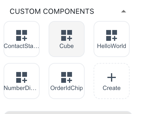
The cube component appears in the component library
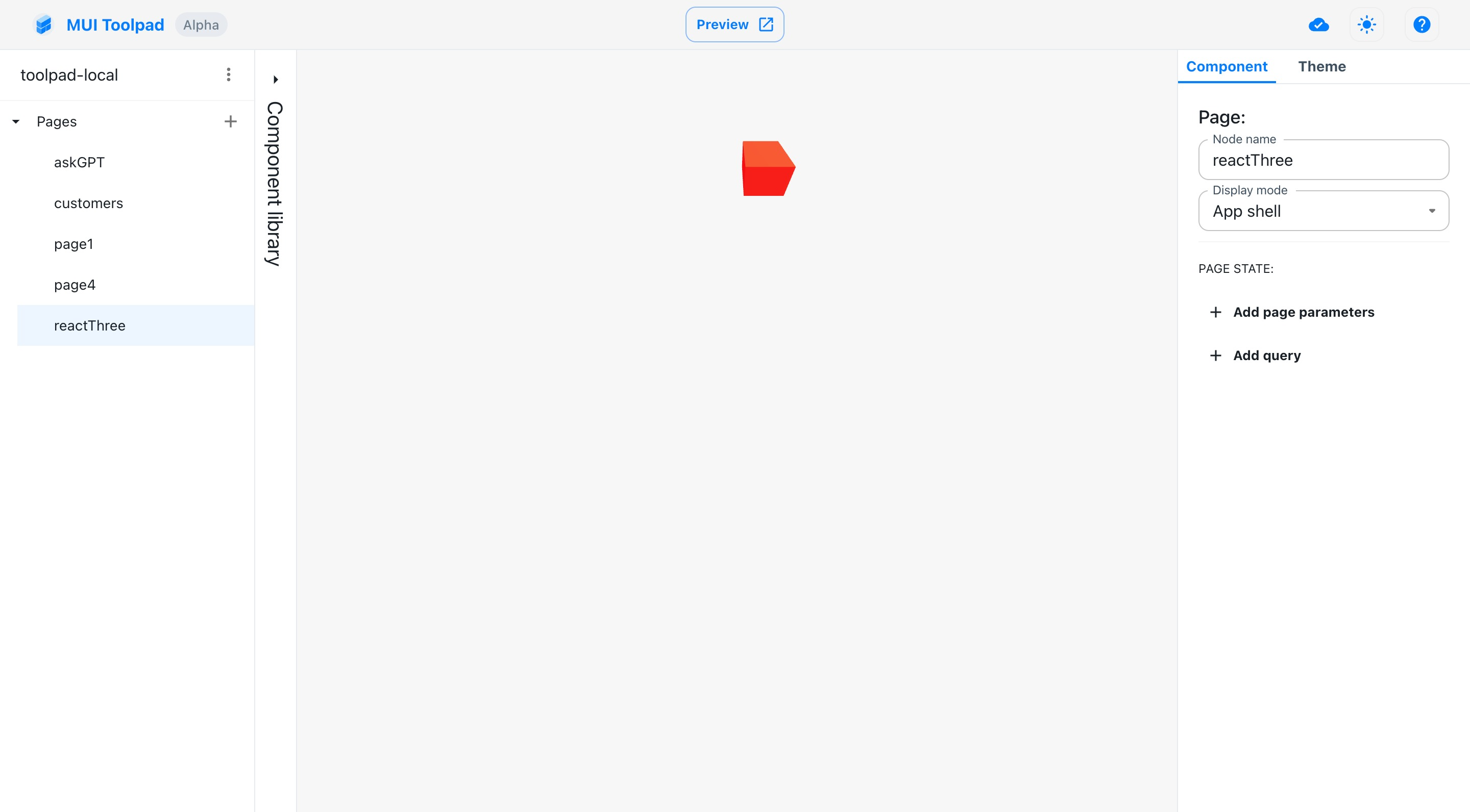
Using the component
- Drag a cube component on the canvas. In the inspector, you'll see the
positionproperty as a bindable property.
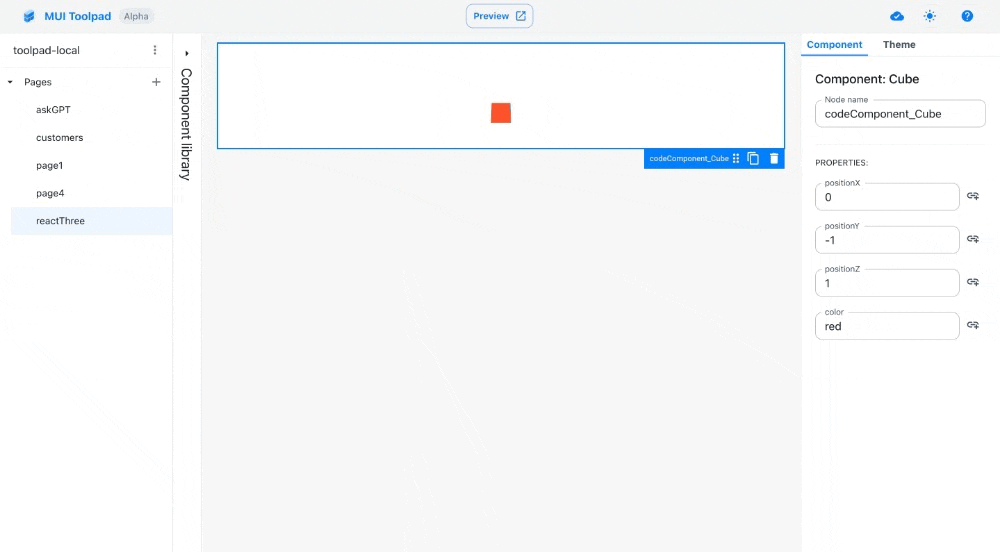
The cube component