Custom components
You can bring your own custom components inside the Toolpad Studio editor.
The steps below explain how to create and use a custom component in Toolpad Studio.
Create component
- Open the Component Library by hovering over it with your mouse.
- Click Create in the custom component section.
- Supply a name for your component in the dialog that opens. Click Create to initialize a new component.
- In the snackbar that appears, click the Open button. Your code editor will open with the newly created component.
Add component code
Toolpad Studio exposes a createComponent function. This is used to signal to Toolpad Studio which are the components that can be imported and how it should interpret the properties.
import * as React from 'react';
import { createComponent } from '@toolpad/studio/browser';

export interface HelloWorldProps {
  msg: string;
}

function HelloWorld({ msg }: HelloWorldProps) {
  return <div>{msg}</div>;
}

export default createComponent(HelloWorld, {
  argTypes: {
    msg: {
      type: 'string',
      default: 'Hello world!',
    },
  },
});
The props defined in the argTypes object are available as editable properties when inspecting the custom component:
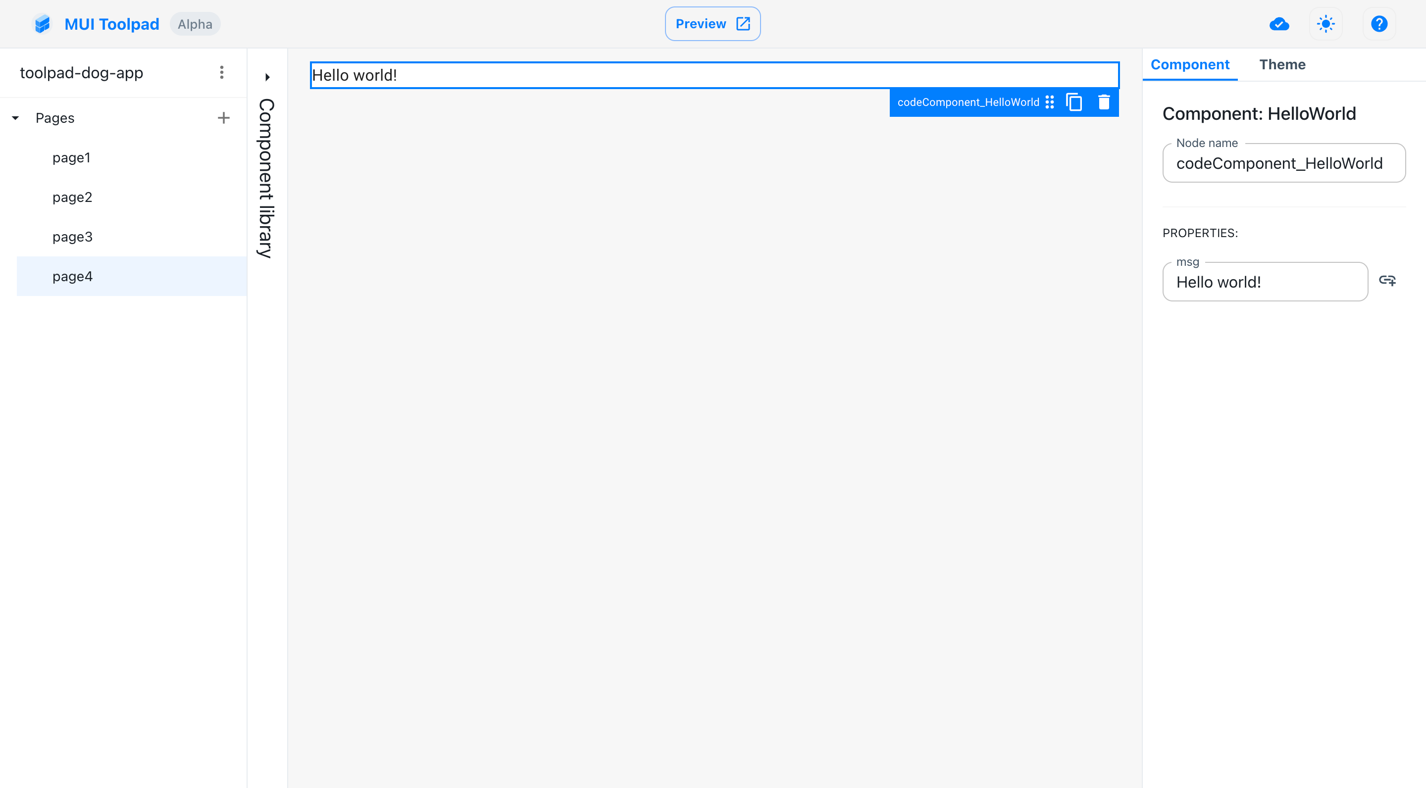
Props of our custom component
Component Library
Custom components become available in the component library, alongside an option to create a new one. To use a custom component, drag it from the Component Library into the canvas. The component will be available under the Custom Components section.
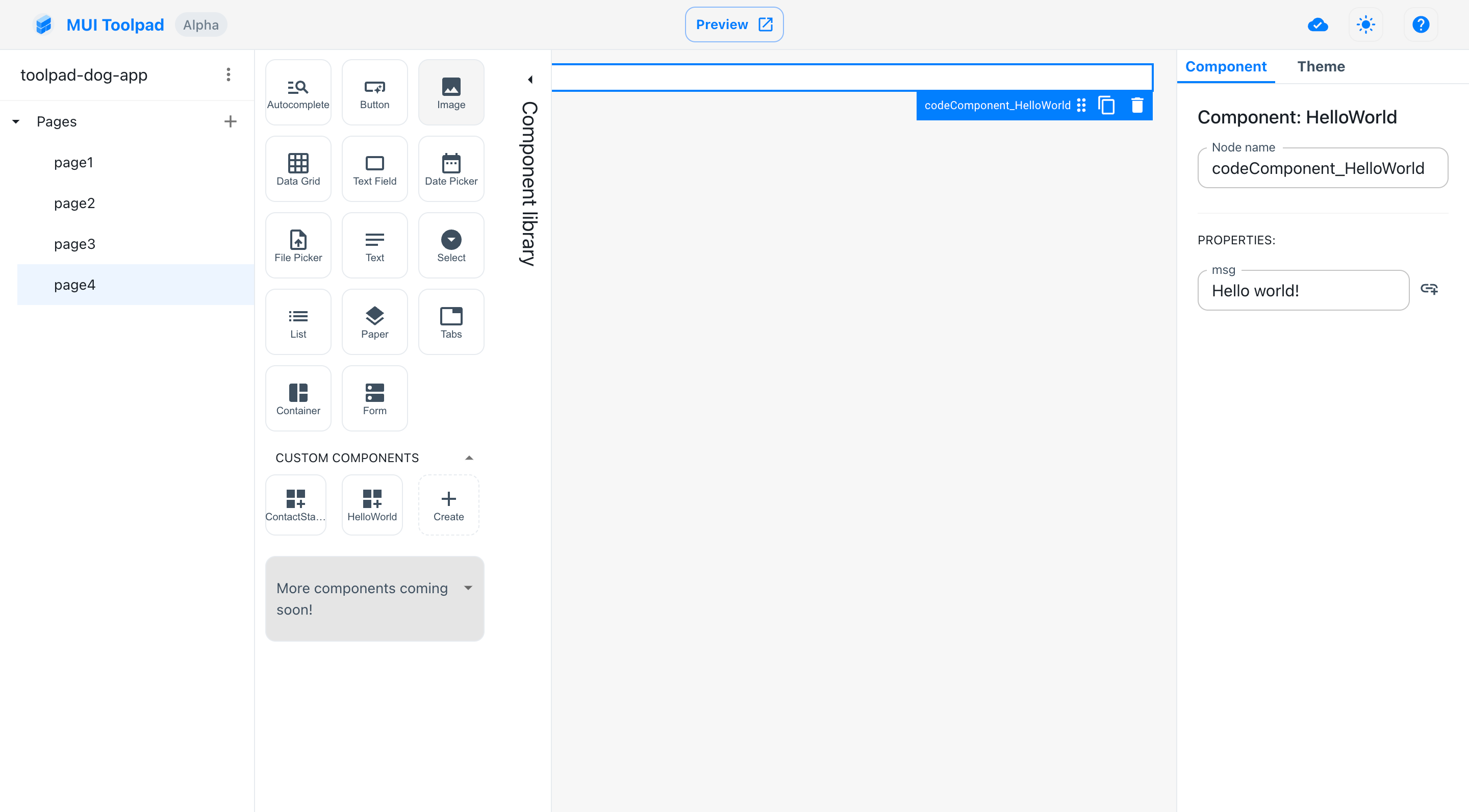
Custom components in the library
Manipulate external state
As shown in the previous section, properties can act as input to the component. But it doesn't have to stop there, You can define certain properties as input/output and have their value synced automatically with page state. This is how for example the built-in TextField component works.
To write back changes to a property you'll have to define a secondary property on your component that acts as an onChange handler. You then add the onChangeProp property in the argument type to connect both properties as an input/output.
import * as React from 'react';
import { createComponent } from '@toolpad/studio/browser';

export interface HelloWorldProps {
  msg: string;
  onMsgChange: (newMsg: string) => void
}

function HelloWorld({ msg, onMsgChange }: HelloWorldProps) {
  return <input value={msg} onChange={event => onMsgChange(event.target.value)} />;
}

export default createComponent(HelloWorld, {
  argTypes: {
    msg: {
      type: 'string',
      default: 'Hello world!',
      onChangeProp: 'onMsgChange'
    },
  },
});
This component, when dragged to the canvas, has a msg property that you can't bind to. But you can now bind to this property from other components.