Joy UI - Overview
Joy UI is an open-source React component library that implements MUI's own design principles.
Introduction
Joy UI is an open-source React component library that follows a lightly opinionated design direction, for a clean and modern UI that gives you plenty of room to customize the look and feel.
Why use Joy UI
Maintained by MUI, Joy UI is an alternative to Material UI for projects that don't adhere to Material Design guidelines as a design system starting point.
These two sister libraries feature many of the same components, with similarly designed component APIs and customization features. Joy UI applies the decade of lessons learned in building and maintaining Material UI, for developers looking for sleek design, next-gen DX, and extensible components.
Learn more about why you should use Joy UI for your next project below.
Beautiful out of the box
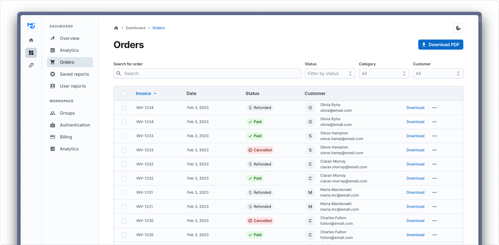
Joy UI follows a lightly opinionated design direction called Joy Design. Simple and functional, it offers a thoughtfully crafted set of defaults to ensure that your next project looks and feels great before you even begin customizing.
For example, the Order Dashboard template (pictured below) is minimally customized beyond defaults, to demonstrate how meticulously we've designed each component for consistency and cohesion across the UI:
Highly customizable
You should feel inspired and empowered to change, extend, and revamp Joy UI's appearance and behavior with ease. Drawing from many years of experience maintaining Material UI, Joy UI applies new approaches to customization, enabling you to customize every piece of the components to match your unique design.
For example, the demo below shows how to customize the List component using built-in CSS variables to match the design of the Gatsby documentation side nav:
- Documentation
- Overview
- Quick Start
Tutorial
9How-to Guides
39
Developer experience
Joy UI draws its name from the idea that it should spark joy in the creative process of building apps. Providing an unrivaled developer experience is at the heart of this.
For example, observe how each element of the Input component automatically calculates and adjusts its own dimensions relative to the border radius, saving you from the tedium of doing it yourself:
Accessibility
Joy UI components are built on top of MUI Base's unstyled components and low-level hooks, giving you many accessibility features out of the box. We strive to make all components accessible to end users who require assistive technology, and offer suggestions for optimizing accessibility throughout our documentation.
Joy UI's Form Control component automatically generates a unique ID that links the Input that it wraps with the Form Label and Form Helper Text components, ensuring that your app complies with this guideline:
Start now
Get started with Joy UI today through some of these useful resources: