Building UI
Toolpad Studio allows you to build your frontends fast so you can concentrate on writing logic.
Component Library
To access the list of available Toolpad Studio components, hover your cursor over the vertical bar labeled Component library to expand it.
Toolpad Studio has many built-in components, and more are continuously being added. To make it easier for us to understand what to add next, please upvote the components you need, or open a feature request.
Using components
Each component has a set of properties that you can tweak in the inspector panel on the right. To view the page structure, and select or rename components, use the page hierarchy explorer on the bottom-left.
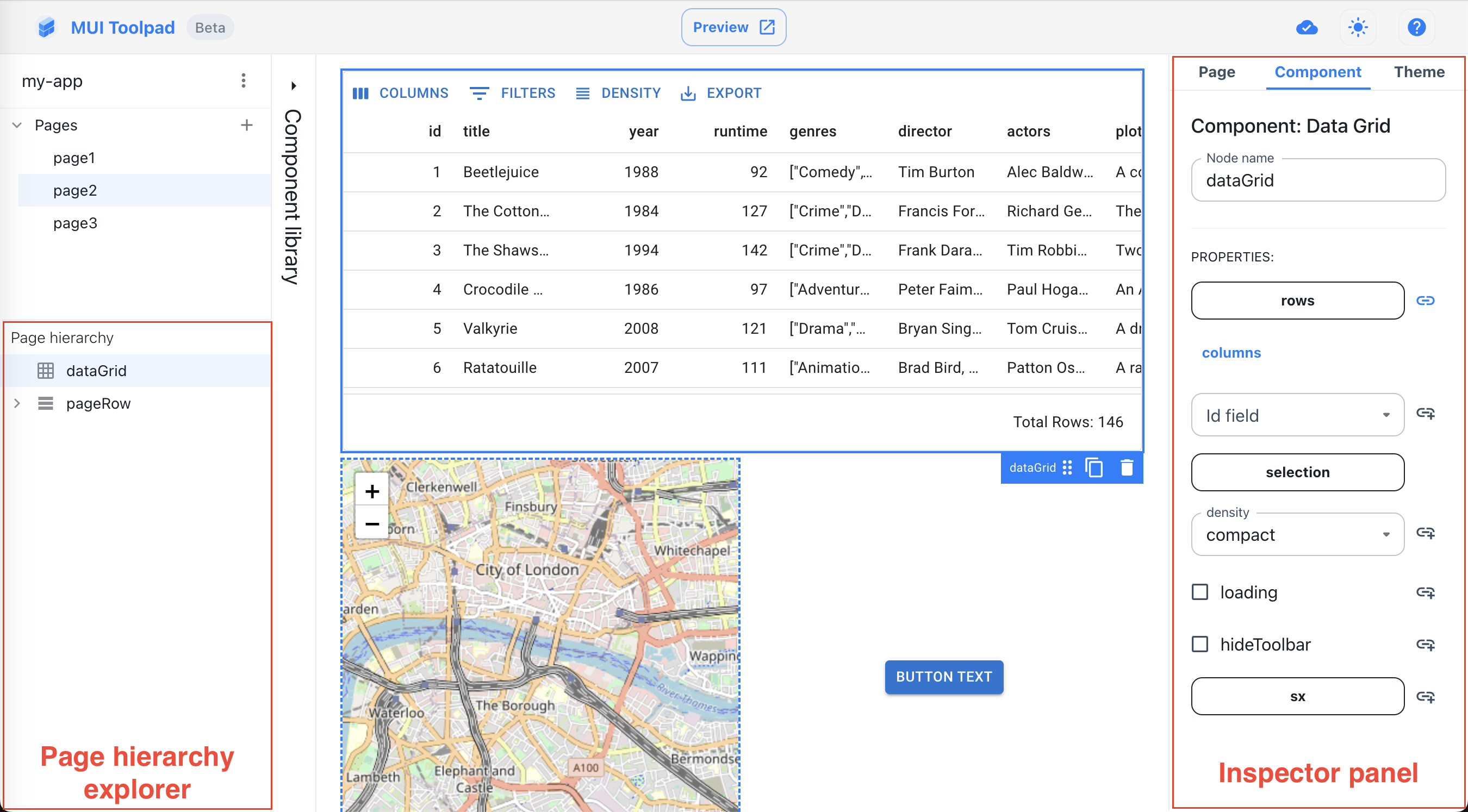
Inspector panel and page hierarchy explorer
Below are the step-by-step instructions on adding, moving, deleting, and resizing a component in Toolpad Studio:
- Open the component library and drag a component over the canvas.
- The canvas will highlight the location where the component can be dropped. Release the mouse to drop it.
- To select a component, click on it either in the canvas or in the page hierarchy explorer. An overlay indicates the selected component.
- To move a component, drag it from its drag handle in the overlay and drop it at its new location. The canvas will highlight available drop locations with a blue indicator.
- To delete a component, click the bin icon in the overlay. You can also press the Backspace key while the component is selected.
- Components can be horizontally resized within the grid boundaries:
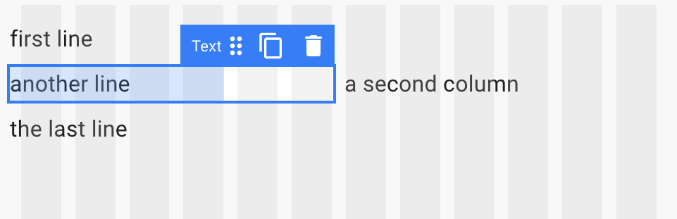
Resizing components along columns
Binding dynamic values to these properties is explained in the data binding section.
Canvas grid
Rows
Toolpad Studio canvas uses a grid layout where you can use rows to position components:
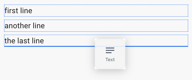
Canvas grid rows
Columns
Or place them in a dedicated column besides other components:
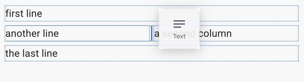
Canvas grid columns